In the last part of our Car Design Essentials series, we look at how to place faces and lines atop your muscles
Designers talk of “having an eye for design,” an intuitive sense of what’s harmonious and what is undesirable but what exactly are the components of the criteria that they’re using? Essentially, it breaks down into three steps, which we term ‘Bones, Muscles and Graphics’. In this final part, we examine the third element of evaluating automotive design…
Step 3: Graphics
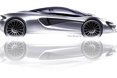
Young or inexperienced designers too often get totally wrapped up in graphics, rather than focusing on the proportions and being clear about what form language they are employing. “You need great proportions, and around that build great details.” says Rob Melville, chief designer, McLaren. “It’s the same with a song – one that has perfect rhythm, and then has nuances and details.”
Indeed. A composer doesn’t start with the triangle or a twiddly flute part, but rather with establishing the core rhythm, bassline and chord progression that underpins the overall composition.
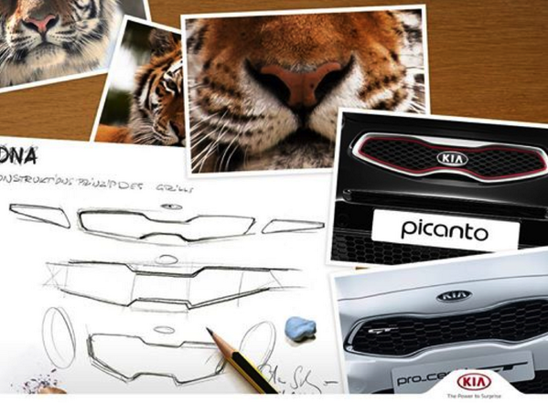
Similarly, if muscles define the 3D form on top of the bones in an animal, so the graphics (or markings) give it its final identity. Without the spots on the leopard, it could easily be mistaken for a panther. Thus, we can regard the graphics as the third element to giving character and identity to any car design.
Features such as grilles, lamps, window shapes and shutlines are all exercises in graphics, applied once the basic surfaces are in place. Arguably, it is this area of car design that has had the most advances over recent years. The degree of sophistication in car graphics has formed the topic of many articles on CDN and is a crucial area of trend changes that are mapped at motor show reviews.
So, how do we identify the components of car graphics?
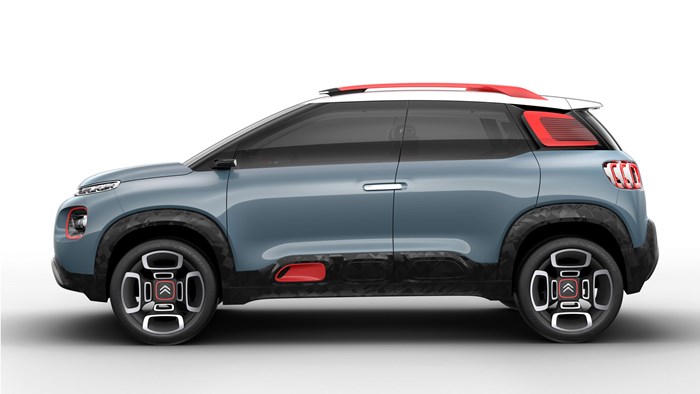
1) Colour & Contrast
Breaking up the underlying form using colour is the most literal use of graphics on a car. Whether it is two-tone paint, a contrasting roof colour, pinstripes, decals, black side protectors or wheelarch cladding, the aim is to break up the surfaces to provide more visual interest to how we ‘read’ the design – and often to remove visual heft from tall bodysides.
2) The ‘Face’
From their very inception, the front ends of cars have been likened to a face – either animal or human. Designers typically spend more time fretting over the front end than any other area. It’s the most important graphical area on the car, as it needs to be clear and unambiguous. Designers talk about the DRG – Down-Road Graphics: the bold impression of the front of the car from 100m away. It can be the main device with which to make your brand recognisable at a glance.
The analogy of an animal face tends to be generated by overall proportions and spacing of elements – for example the eyes or a snout – and are often generated by just one or two quite subtle cues. The analogy to a human face in a car is usually more about the ‘eyes’ themselves – the expression rather than the whole face.
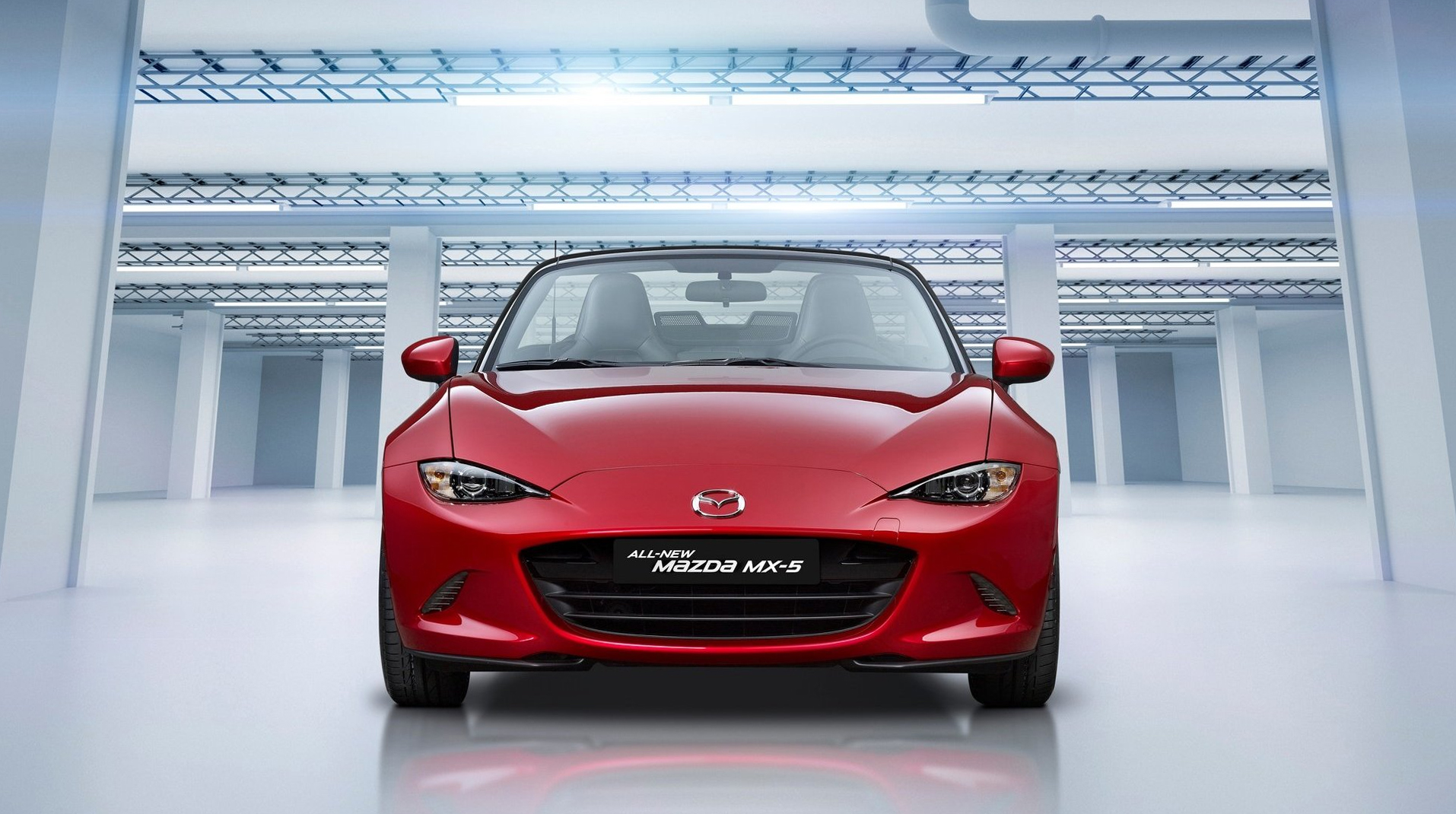
Should the expression be a frown or a grudging smirk, like a cheeky kid caught in the act? Or the wonderful boisterous laugh of a Frogeye Sprite? Maybe an alert, intelligent face, or a mad, Jack Nicholson-like grimace? It’s all highly critical. If it becomes too literal, or too caricatured, it quickly becomes immature as a piece of sophisticated product design, leading to doubt – or more likely rejection – by consumers.
The whole area of the semantics of car faces is a rich topic, and one that is likely to absorb a lot of effort and energy in any car design team.
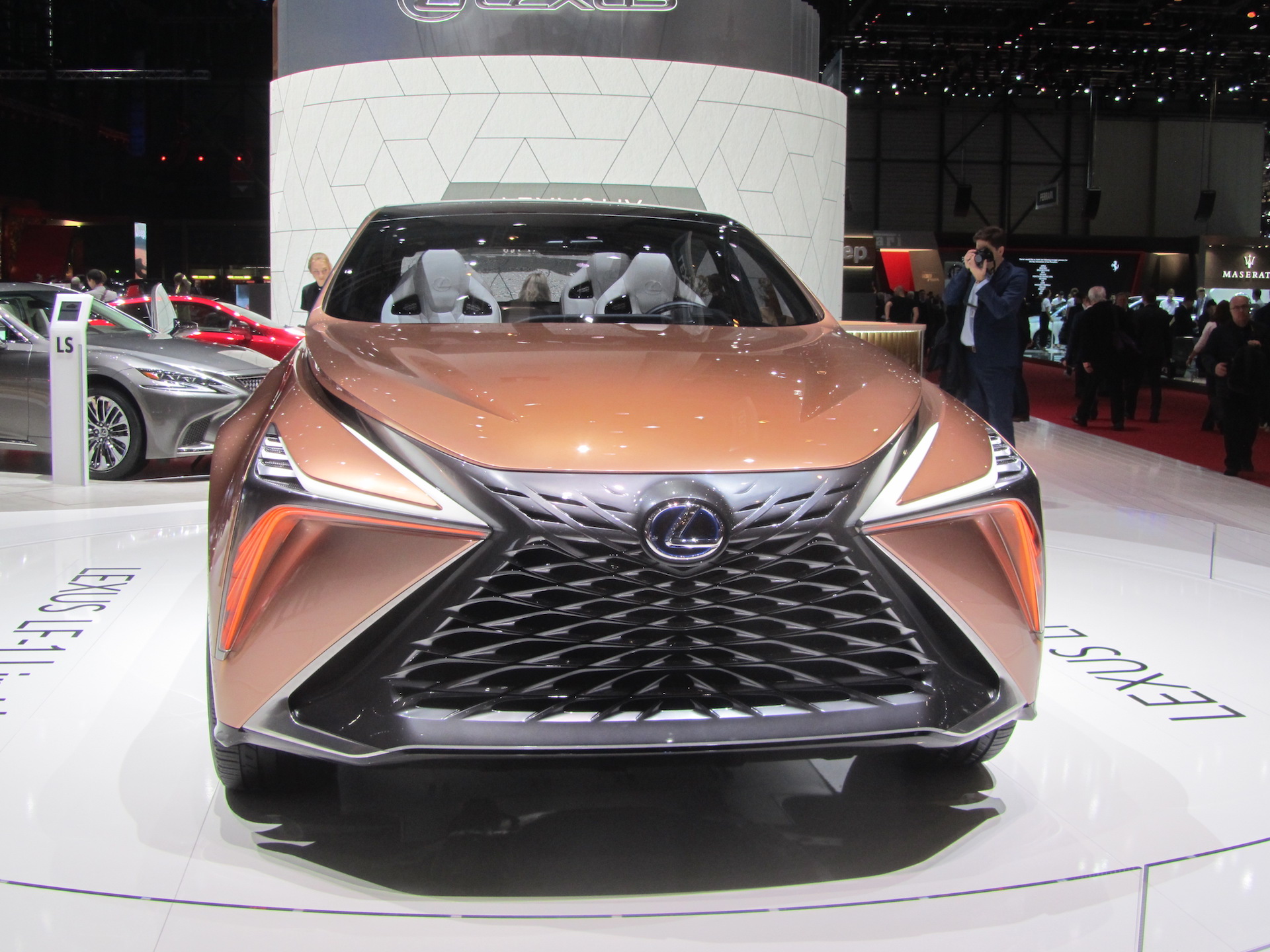
3) Grille
Within the ‘face’, the grille is a major component that makes up the overall DRG graphic, and the degree of design sophistication that is expended on grilles has been huge in recent years. Whereas in the past the grille outline was the main focus, today the texture within the grille, the grille bars themselves and integration of elements such as radar and cameras, will be the subject of copious design effort.
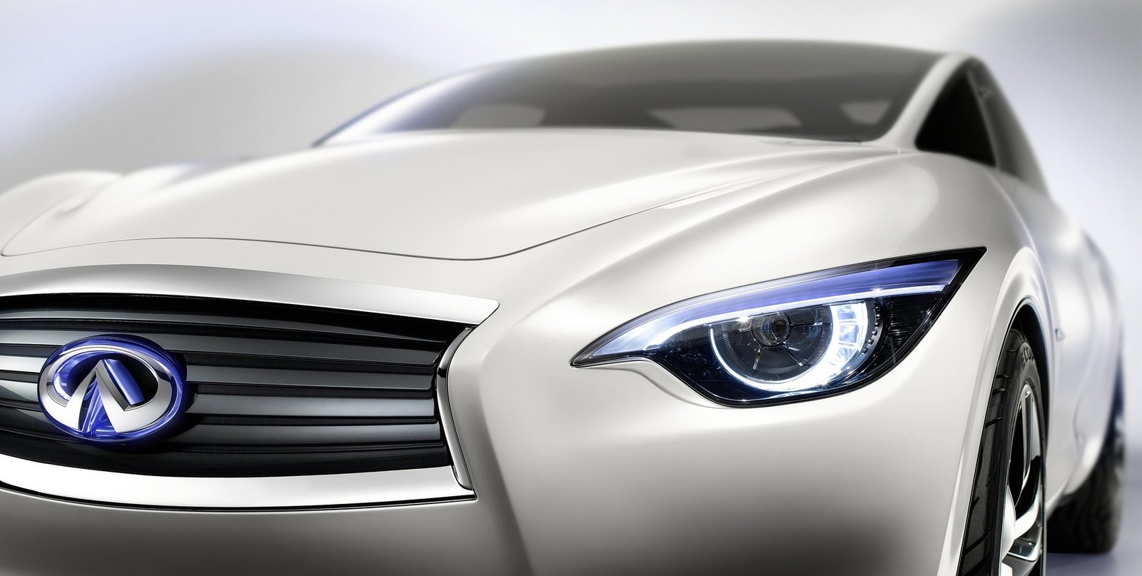
4) Lamps
Likewise, headlamps are the other big contributor to the ‘face’ of the car, and the comparison to eyes has long been established.
Three big changes have taken place. In the past, the outline shape of the lamp on the underlying 3D surface was the main focus of design effort. As lamps moved outboard and upwards onto the hood surface they have become more three-dimensional, often protruding out from the A-surface and having their own volume, or shape.
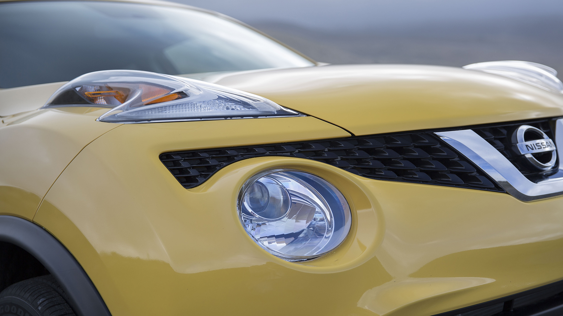
Secondly, LED lamp technology leads to new expressions in the ‘eyes’ compared to previous bulb headlamps and a far wider range of possibilities in terms of expression.
Lastly, the technical look is enhanced by intricate detailing in the lamp can itself, although this is only observed up close and the overall outline shape is still the dominant graphic element in terms of the overall car composition.
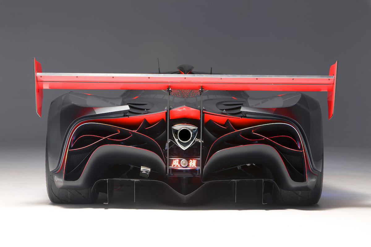
Tail lamps are a graphic component for the rear of the car, the ‘face’ being comprised of the lamps and the rear licence plate. It is surprising how much facial expression can be wrought through these three parts and the degree of semantics that we read into the resulting composition.
5) Daylight Opening (DLO)
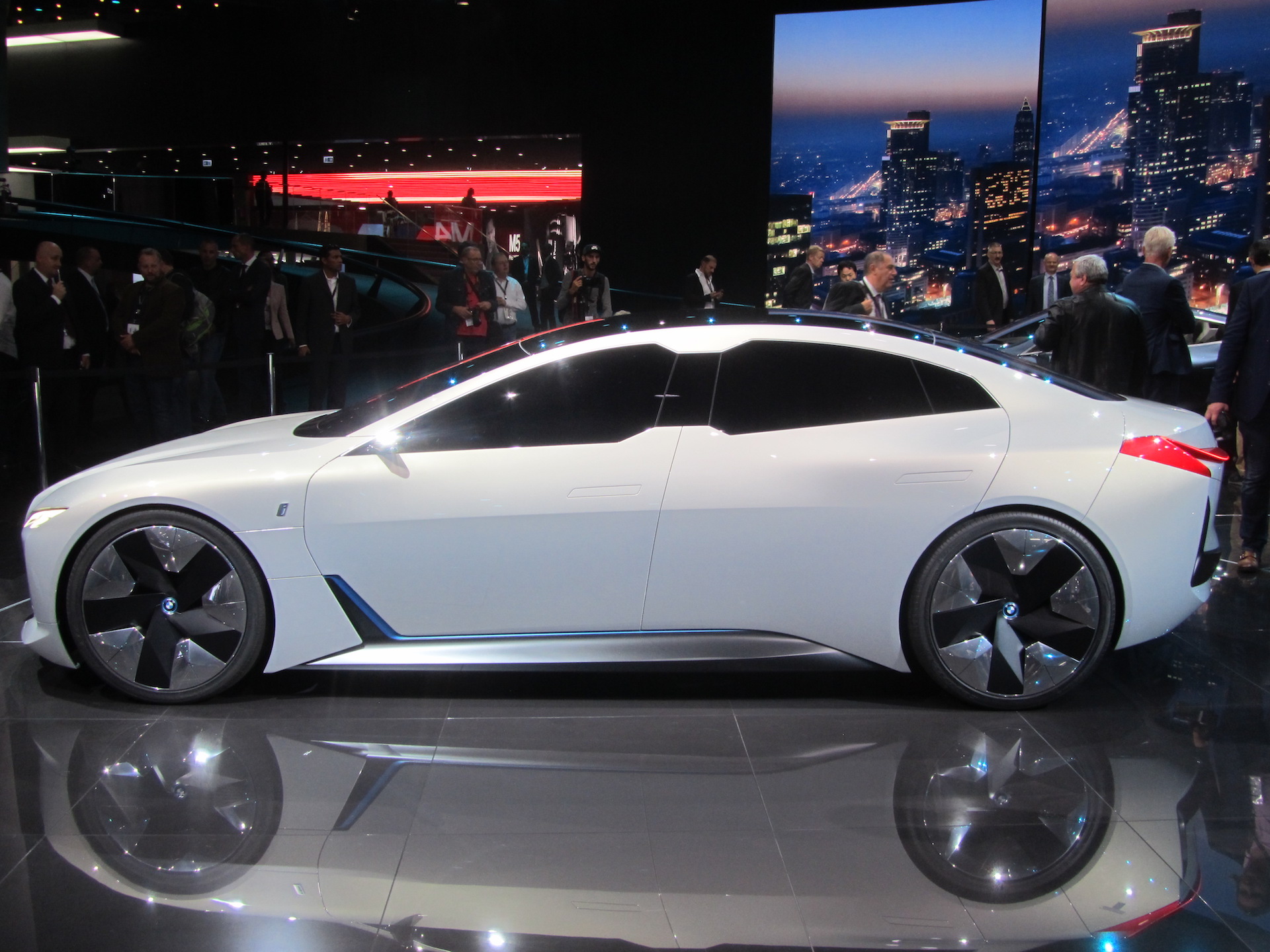
The side window graphic – the DLO – is the other major graphic feature on a car and one that provides a lot of the character. Coming up with a fresh or unique DLO graphic is demanding, and very subtle shifts in corner radii and lead-ins are employed to provide a fresh twist to this layer of the design process.
Blacking out the B-pillar and framing the DLO shape with chrome are further graphic devices used to enhance the underlying shape.
6) Shutlines
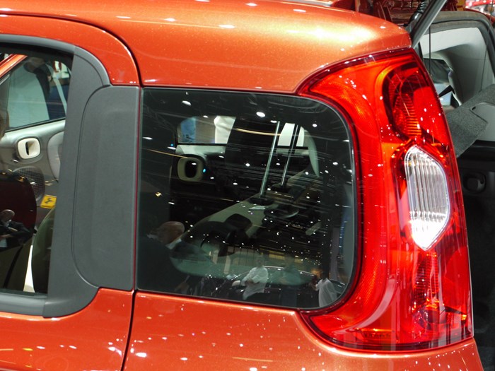
Shutlines – the joins between panels – are important graphic elements that can add considerable quality to a design, and are often overlooked by students. Door shutlines running down a bodyside are a key device that allow us to ‘read’ the surfacing, and without them we often struggle to interpret exactly how the surfaces are composed.
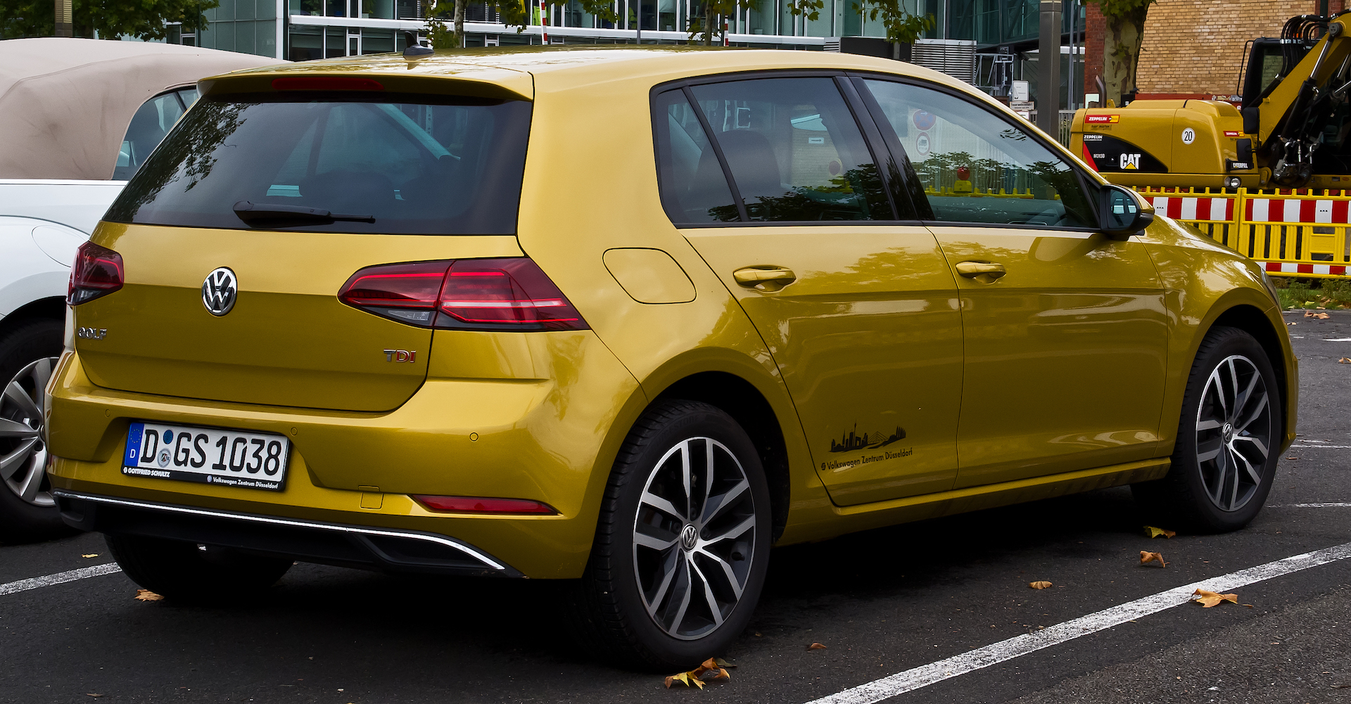
Thus, shutlines are another weapon in the designer’s toolkit to sweeten the surfacing. Because they run over curved surfaces, shutlines can express a lot of emotion in the design, and help to ‘punctuate’ the underlying surfaces. We also admire sophistication in design and shutlines can be used to graphically tie together necessary functional components such as a fuel filler or charging port in a visually satisfying way.
The desire to delete parting lines is natural but mistaken: they are a wonderful opportunity to enhance a car design and most experienced designers enjoy this stage of the process to add a further layer of emotion to their composition.
7) Wheels
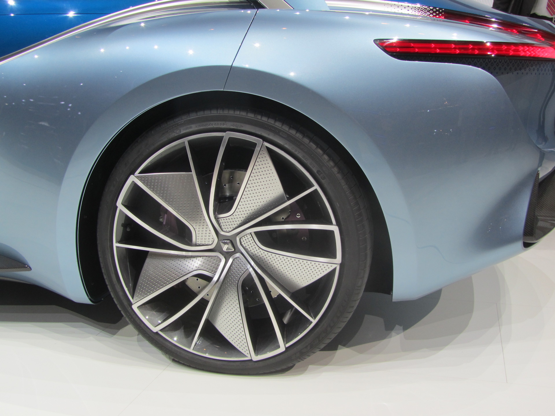
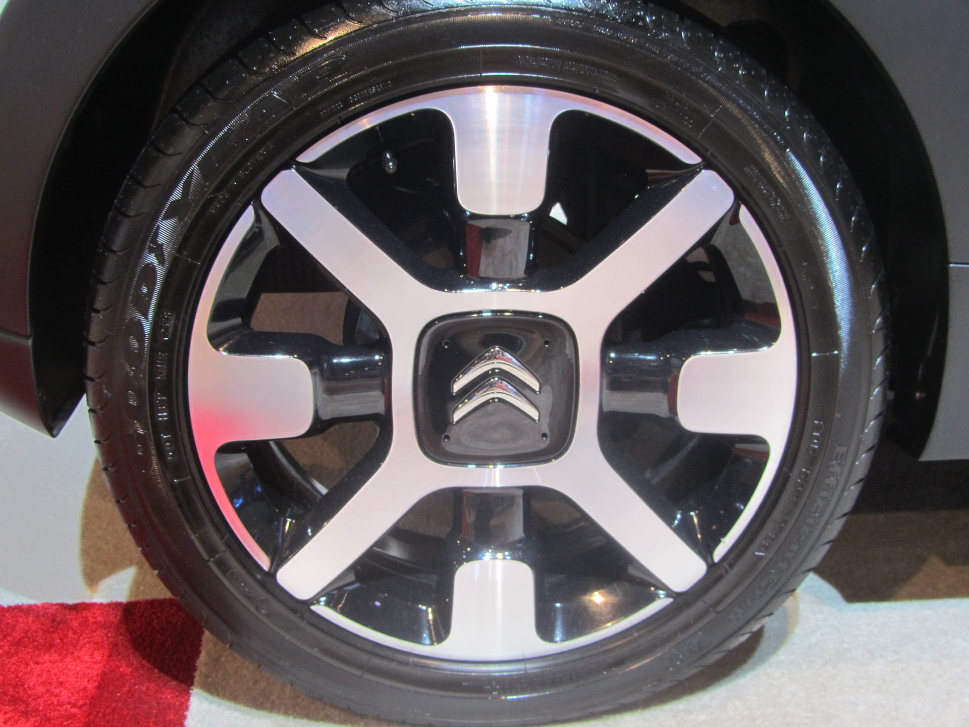
It may seem odd to include wheels here but they are bold graphic elements. Sure, up close there is a lot of 3D detailing going on in the spokes and the intersection of spoke and rim but from a few paces one only sees the overall composition. Coming up with a new wheel is essentially a graphic design exercise; only once the overall theme is set will it be developed fully in 3D to provide more unique features within the design.
Wheels are an important component to the overall car and are used to enhance the underlying character of the design, be it sporty, elegant, retro, rugged or urban, for example.
The use of graphics is one of the most misunderstood areas of car design. Children draw animals using markings, not form. They draw only the graphic features and the face, because understanding the underlying form of the animal requires higher levels of skill. Similarly, cartoonists focus on exaggerated graphic features to create humour, and often disregard the actual form of the animal completely.
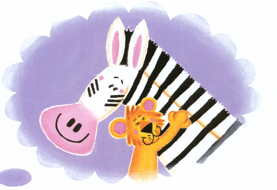
Thus, it is easy to become suspicious of student projects that use strong graphics: look harder and too often it is being used as a desperate attempt to inject some design character because the underlying form and surfaces are weak, or poorly understood.
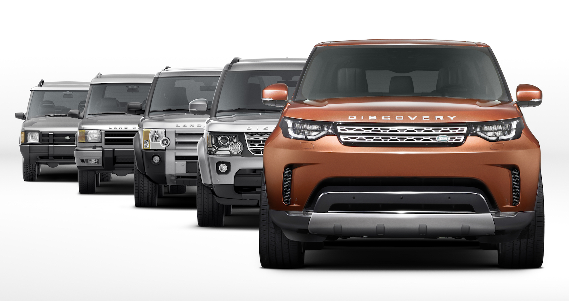
To sum up, the car design process can be considered to be comprised of several layers, each one having a distinct role. We can show the different layers, or elements, of the design process and the components of design via a simple ‘Bones, Muscles and Graphics’ diagram, shown here.
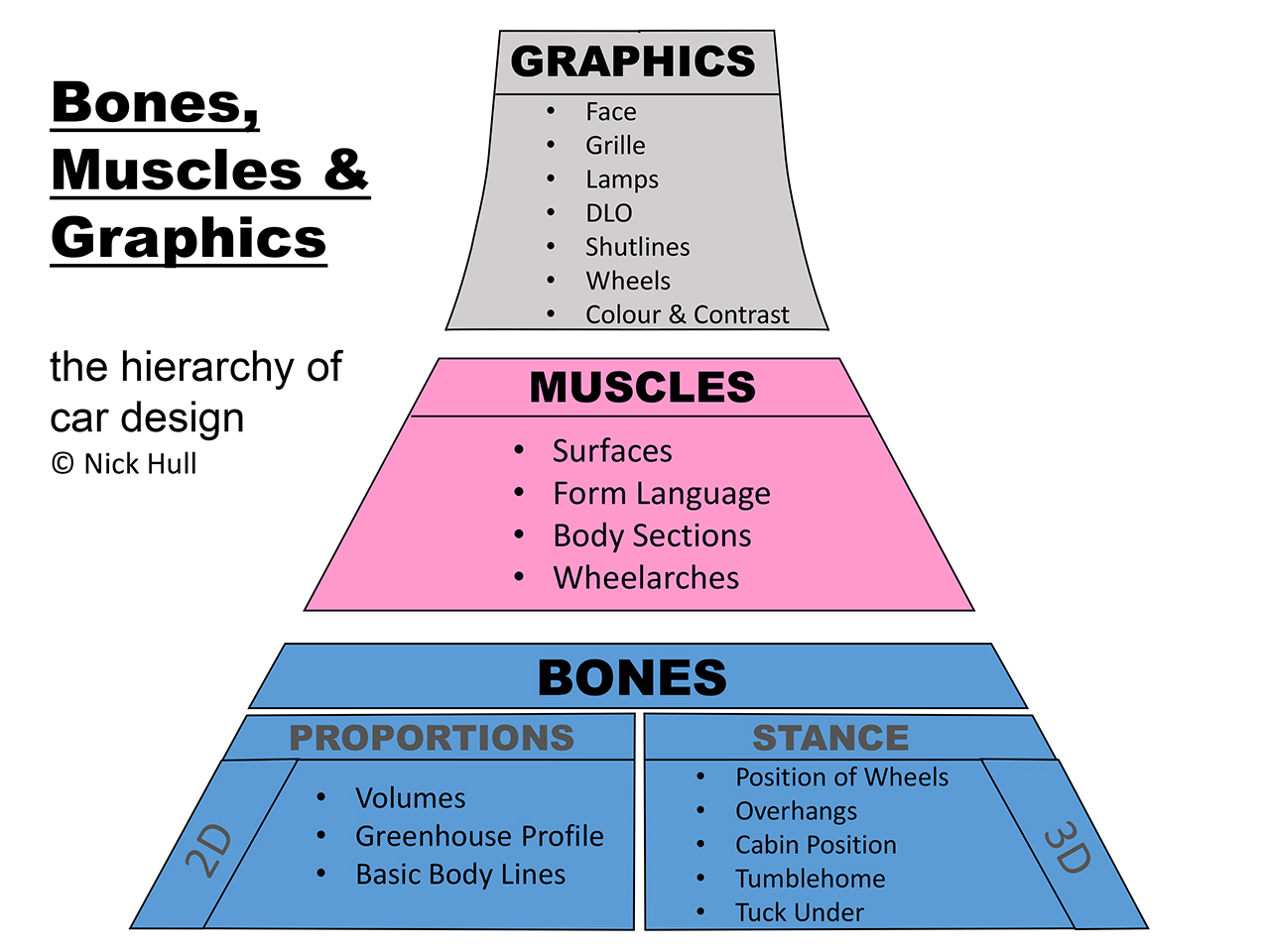
- The base layer is Bones. Small differences in proportions and volumes quickly lead to very different perceptions of good design, thus students need to carefully observe and appreciate these subtleties. This is the first stage for developing an eye for design.
- Then Muscles. Deciding what form language the car has should be clearly communicated, even in first sketches. Resolving those surfaces in a harmonious way is a key skill during the 3D surface development stage. This is the second stage for developing an eye for design.
- The third stage is where Graphics are applied to the underlying surfaces. They are relatively easy to continually modify and refine until a late stage in the design process. Automotive design students often come up with mediocre results for cars because they focus mainly on graphics at an early stage in the process, rather than the underlying form.
- Be aware of how and when to use the various components to build the design, be it a grille shape, DLO, wheelarch or shutline. What part of the process are you dealing with, and why? In particular, don’t focus on graphics at the expense of volumes, good proportions and surfaces.
Car Design Essentials Part 1: Bones
- 1
- 2
- 3
 Currently reading
Car Design Essentials Part 3: Graphics

