Getting to know Ingenlath’s first Volvo in the real world, the XC90
Since its launch way back in 2002 the Volvo XC90 has found 636,000 customers. It was so popular that at one point it was Sweden’s biggest export – quite impressive when you consider its products also include flat-packed furniture and Abba. And just as the original signalled a new era for Volvo as it shifted emphasis way from its core wagons to smartly supply demand for family-hauling SUVs, so this new model is somewhat of a watershed too.
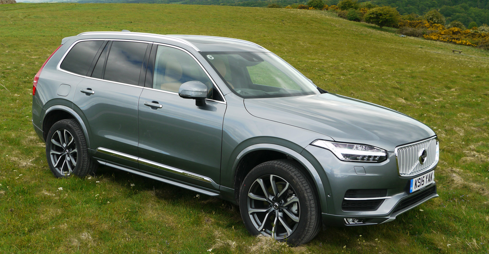
It’s been a long time coming thanks to various major changes within the company including its sale to Chinese company Geely. But for all its tumultuous gestation this is a very single-minded product that establishes Volvo’s independence, doing away with the last vestiges of Ford ownership. All-new engines, a scalable, modular architecture dubbed SPA and a clear intention to leap from the middle classes to the premium set see to that.
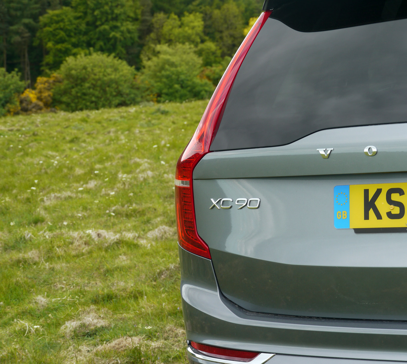
Of most interest to us of course is also the fact this is the first product designed under senior design VP Thomas Ingenlath.
That last accolade is perhaps a little premature as the program was fairly advanced when Ingenlath and co unpacked their pencils in Gothenburg but it’s certainly a very good indication of the future. We’re promised the next new Volvo, expected early next year, will be the work of his team from the ground up.
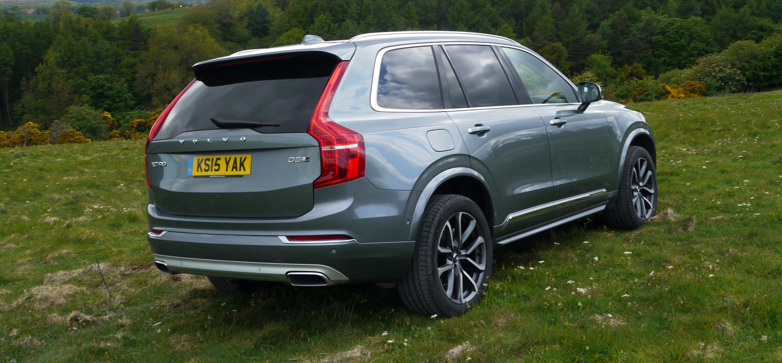
Volvo went through a rather out-of-character period a few years ago in which its products lost their cleanliness and strong proportions and became awkwardly wedge-like and overwrought with frivolous surface treatments. All these have been addressed here, and then some. There’s a real clarity to the XC90, particularly when you see it in context of its increasingly fussy rivals. What remains are extremely strong graphics and, even more so, superb proportions.
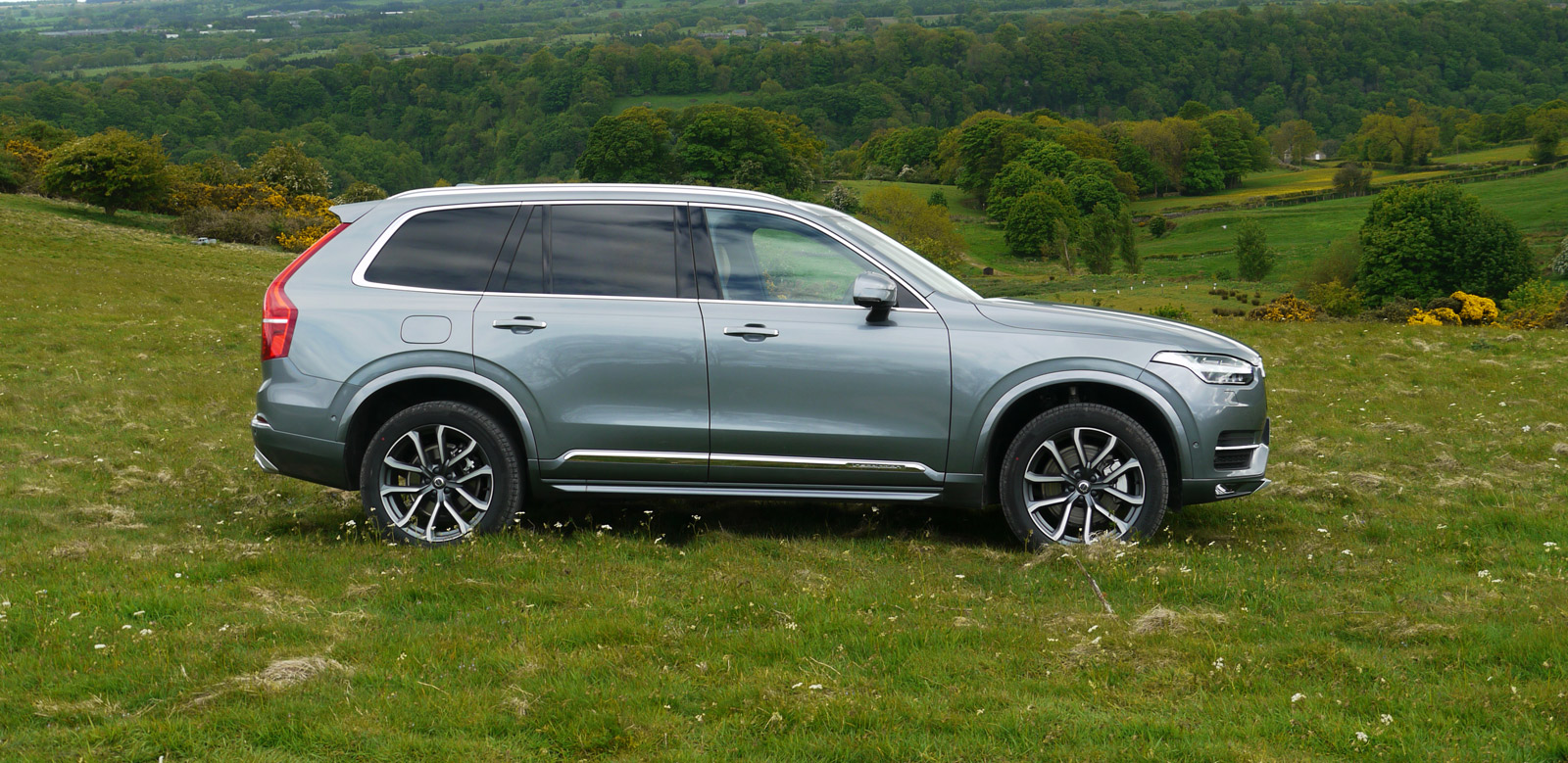
It’s not a car to make anyone go ‘wow’ and it’s all the better for it. What it does is convey a real sense of rationality, solidity and quality. It sits on the road superbly with a great relationship between all its elements, particularly the upper and lower body. It’s unlikely to live as long as its predecessor, but we imagine it should age as gracefully.
Negatives? The extremely distinctive headlamp graphics are somewhat diluted by the strange downward flick of the lamp outline into the fender that brings the first generation BMW X3 to mind, its grille is perhaps a little too classical for its own good (but entirely understandable as a device with which to add a sense of luxury) and the wheel arches can’t make their mind up if they belong to a car or an SUV. Small things and none too detracting.
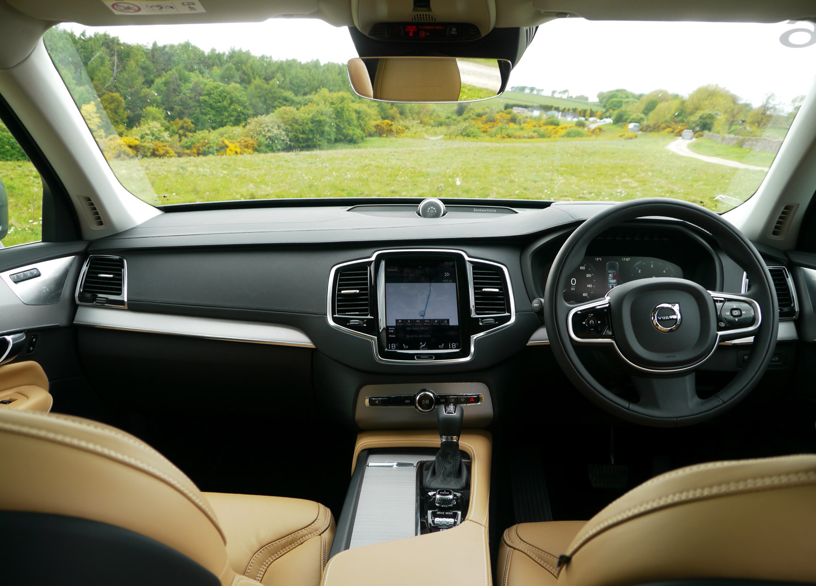
But these things are more about their interiors – and the people and stuff that get thrown into them – than they are about exterior styling. And it’s inside that perhaps the biggest changes have been made. While much of the industry is still grappling with the touchscreen vs rotary controller issue, Volvo has nailed its colors to the mast of its Viking boat and gone full-on screen. It’s an iPad Mini to the Tesla Model S’s power wall, but has a similar portrait orientation. This is important as it allows various pieces of information to be stacked, the theory being that you’re never more than one swipe, prod or pinch away from where you want to be. With some familiarization it does indeed work well. It’s about the fastest we’ve used in terms of processing speed and most commands are faithfully obeyed. Its graphics are clear and simple and most users will find it intuitive on the whole. Overall it’s one of the best touchscreen systems currently available, perhaps alongside the new Renault Espace’s similar setup.
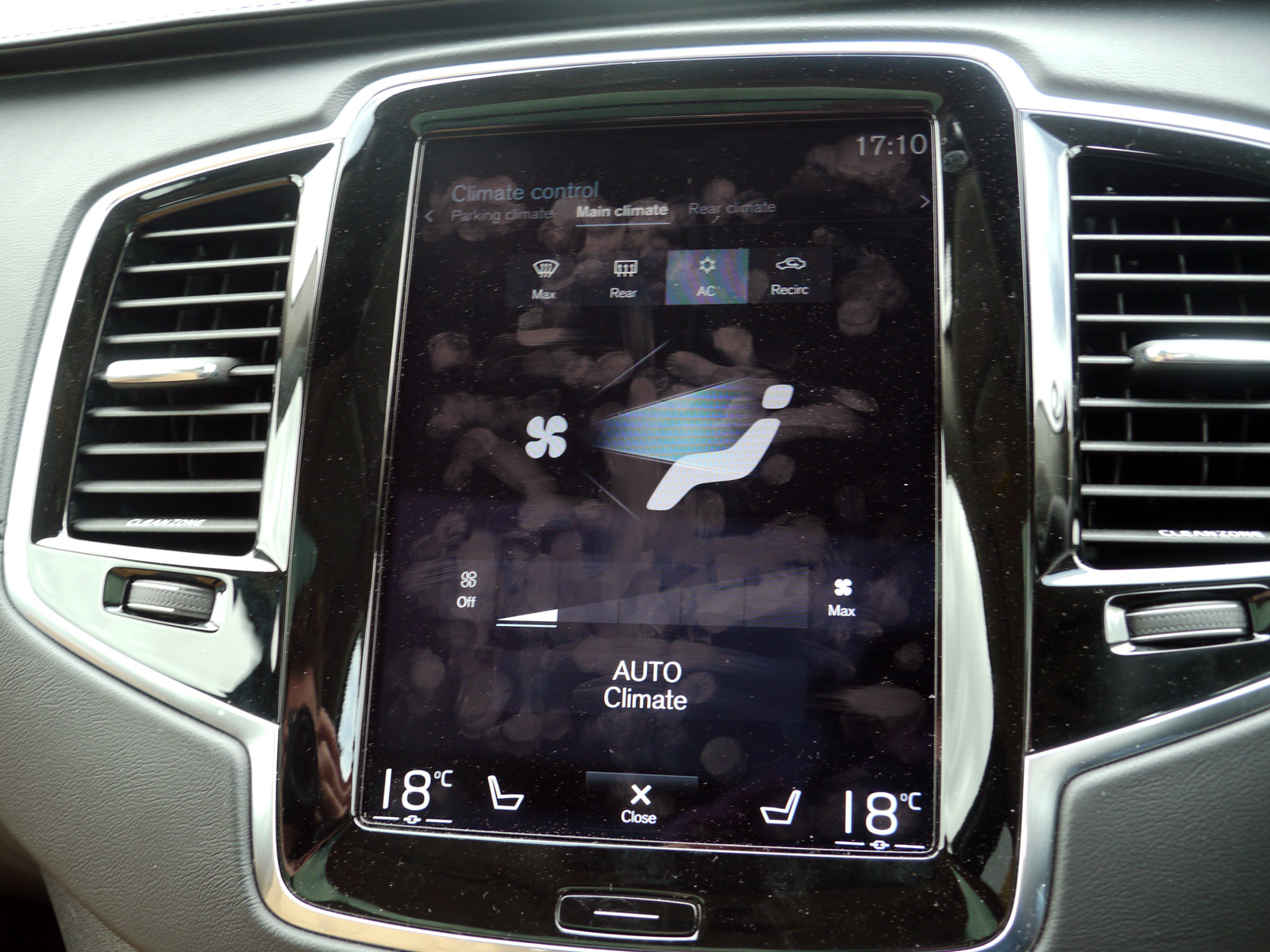
There are of course the usual touchscreen drawbacks – it gets covered in greasy fingerprints along with its piano black plastic surround, and the whole idea of muscle memory goes out the door. Philosophically this is the hardest aspect to accept. Volvo is and has always been a human-centric company, making products that fulfil the use scenarios of its customers. This new HMI strategy doesn’t necessarily change that – indeed the added functionality in the system arguably adds to it – but the industry-standard ergonomics have been abandoned. The ‘fat man’ HVAC controls – a beautifully stylised human figure that you simply pressed to direct air to various areas – has been replicated in the screen but the haptic element has been lost. There’s an increasing agreement that HVAC controls should remain physical rather than hidden in menus and when you had the best system in the world this seems like a real loss. It’s also an aspect that feels was decided quite late in the process with a strangely bare row of switches with quite random functions that sit below the screen.
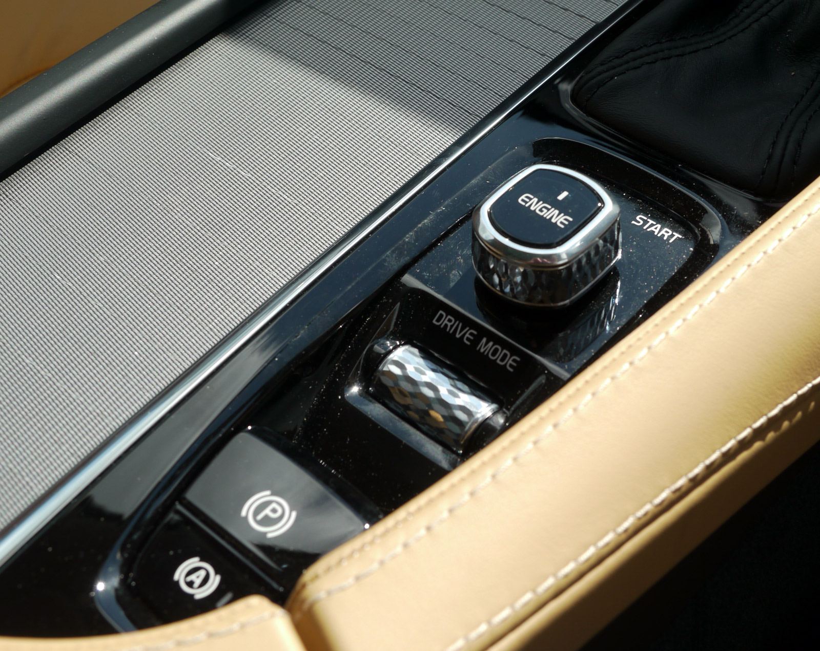
The switches that remain are, on the whole, very nicely executed. Minor controls are wholly conventional, but key functions – a twisting square starter, rotary volume control and cylindrical drive model controller – have a faceted, almost knurled metallic finish. It’s no surprise to learn that Volvo’s interior design chief Robin Page was previously the head of Bentley’s interiors.
A screen also replaces the gauge pack, with great clarity, smooth graphics and the obvious advantage of being fully configurable in terms of the information displayed. It’s quite disappointing to see skeuomorphizm employed here though. Surely this was a great opportunity to break away from the digitized analogue dials that continue to dominate. Still, Volvo is far from alone in this.
The rest of the interior is quite as you would expect. Build quality is very solid, the seats are supremely comfortable and there’s a very good amount of space, even in the third row. Access to these seats – incidentally of the same design and size as the outer units in the middle row – is reasonable as it space. Folding and unfolding seats is also a one-handed job, no-doubt invaluable when grappling with armfuls of kids or belongings.
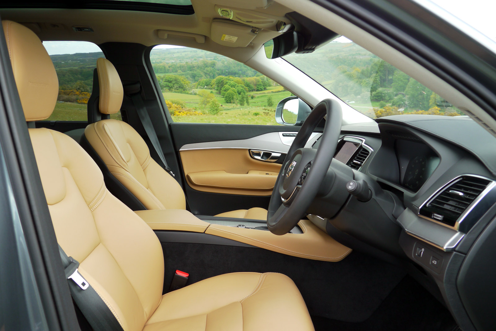
This isn’t a car that necessarily draws you in if you look at, sit-in or drive for a short period of time, but there’s a true depth and thoroughness to its design that starts to appear in layers as you become more familiar. Like the windows that move more slowly at the top of their action to avoid the annoying up-down-up game to open them slightly and the spider ‘easter egg’ hidden in the rearmost storage bin. And that has to be brief met for a vehicle that will almost exclusively be bought by those who are looking for a classy, understated and dependable member of the family.

