


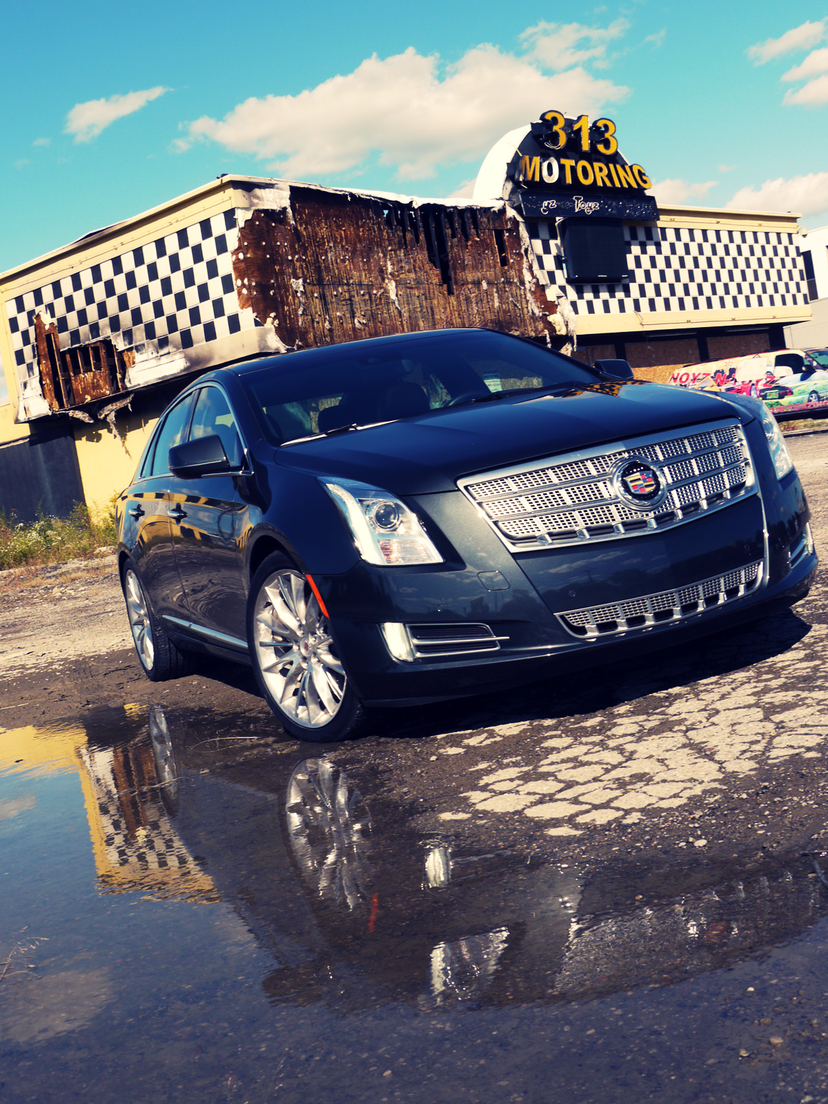
In the light of the new, global-focused ATS and hot-off-the-press CTS sedans, the full-sized, US-centric Cadillac XTS is somewhat of an anomaly in the new Caddy clan. It’s been earmarked as a stopgap flagship before a proper rear-wheel drive challenger to the Mercedes S-class and Lexus LS comes on stream. Car Design News took to the streets of Detroit to find out if it captures that big Cadillac vibe on home turf.
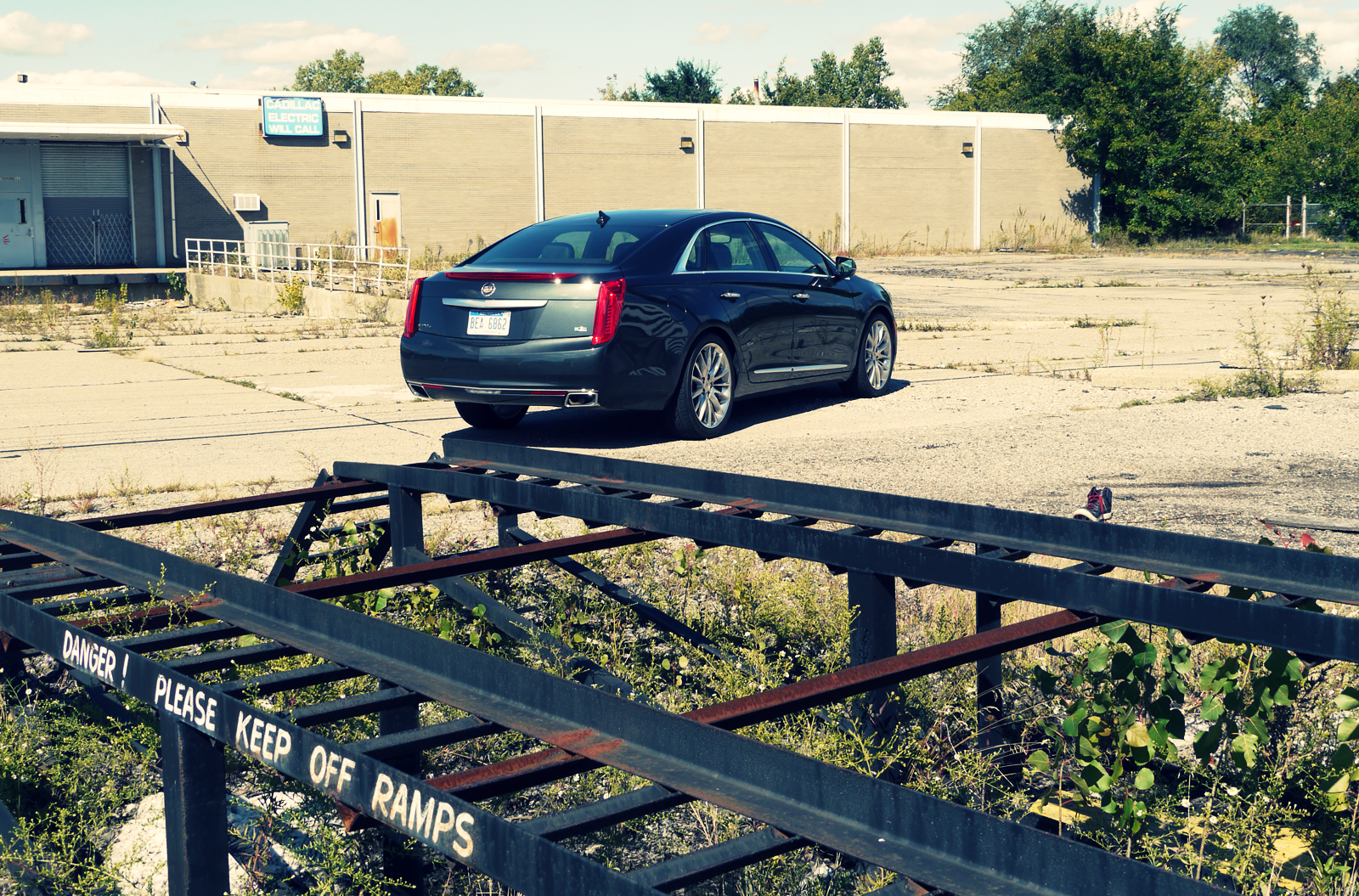
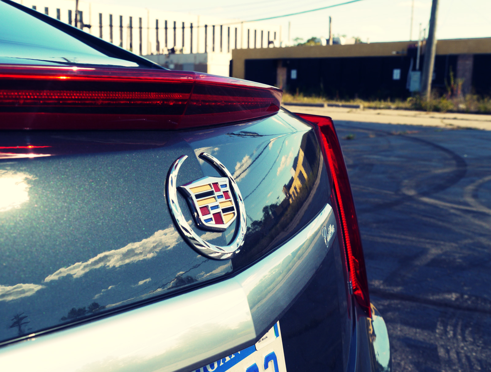
Whichever way you approach the XTS there’s no getting away from its major stumbling block - its awkward proportions born of the use of GM’s Epsilon II platform, here in extended LWB form.
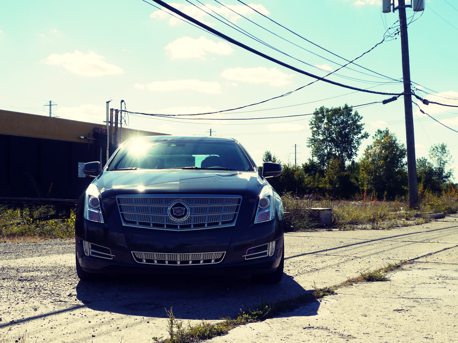
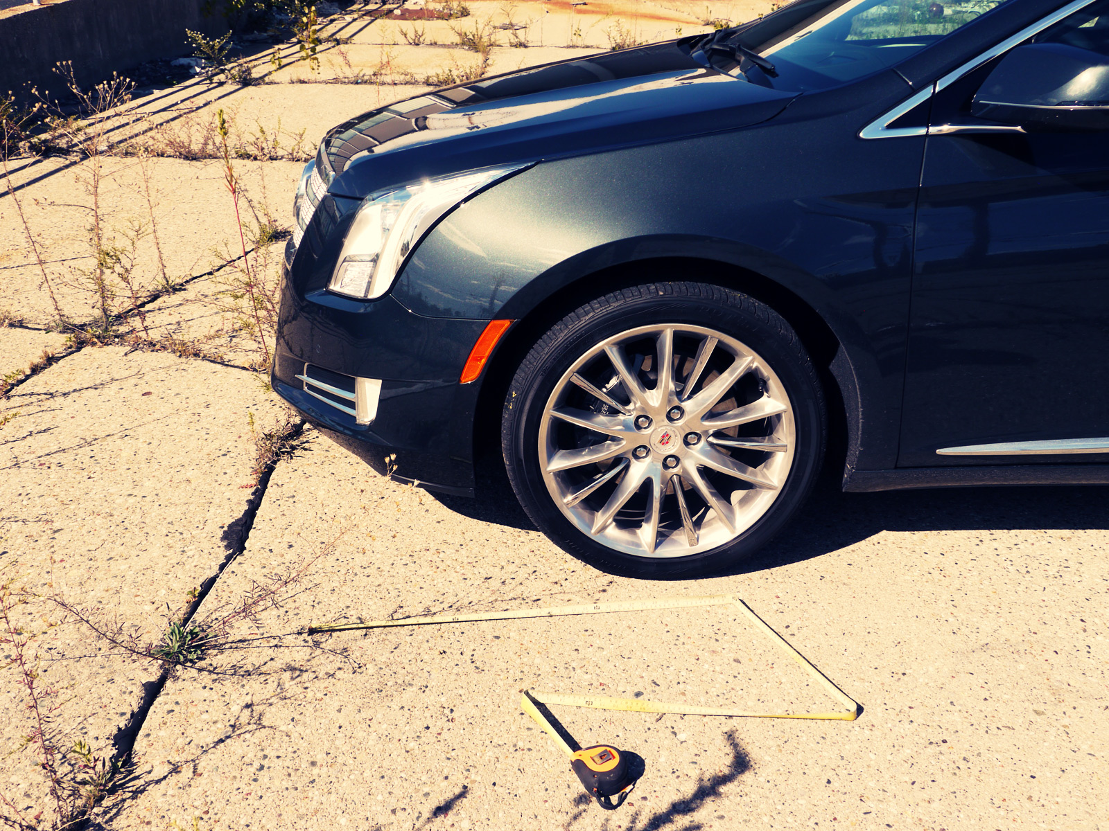
Walk towards it from the front and you’d be forgiven for mistaking it for a C-segment hatchback, such are the stubbiness of its hood and the height of its scuttle. Approach from the rear and the length of the rear overhang and height of the deck - the former to counterbalance that stubby nose, the latter to deal with the scuttle - are more indicative of its size, but still feel unnatural.
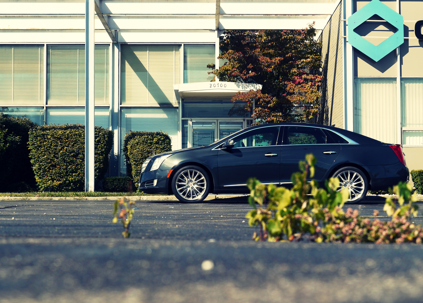
Park it by the curb in front of your favorite Ferndale coffee shop (new Cadillac drivers frequent such establishments as part of their sophisticated, hipster lifestyles don’t you know?) and you’ll be wincing into your latte at the set of proportions the guys in GM Tech Center had to grapple with. Its wheelbase is too short, its front wheel too far back and the rear wheel a distant relative to the base of the C-pillar.
It’s a shame because the graphics and surfacing befit its premium aspirations, on the whole. From the satin finish of its outsized grille to the tip of its complexly modeled deck lid it’s a car that’s best viewed in isolated, tightly-cropped chunks.
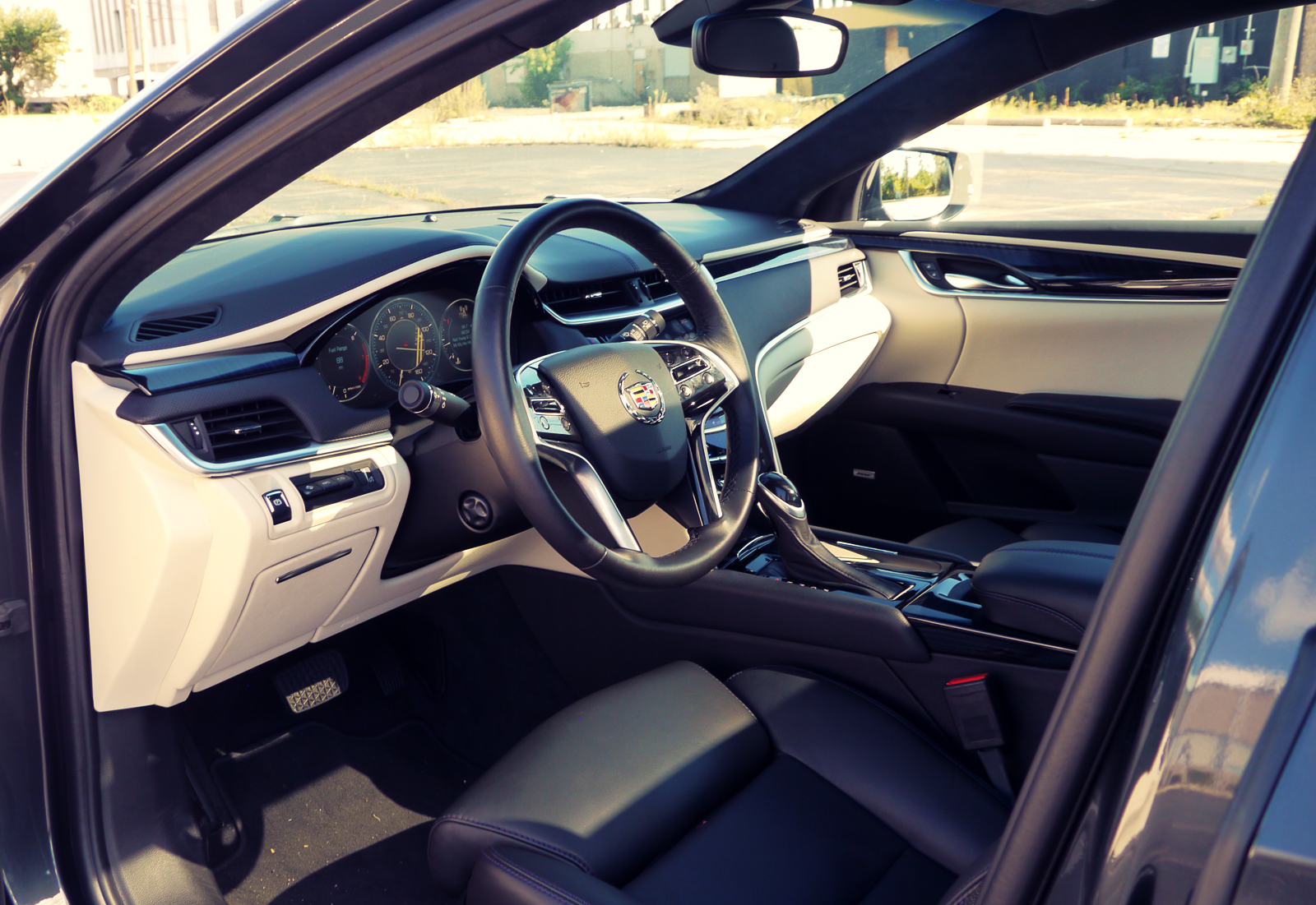
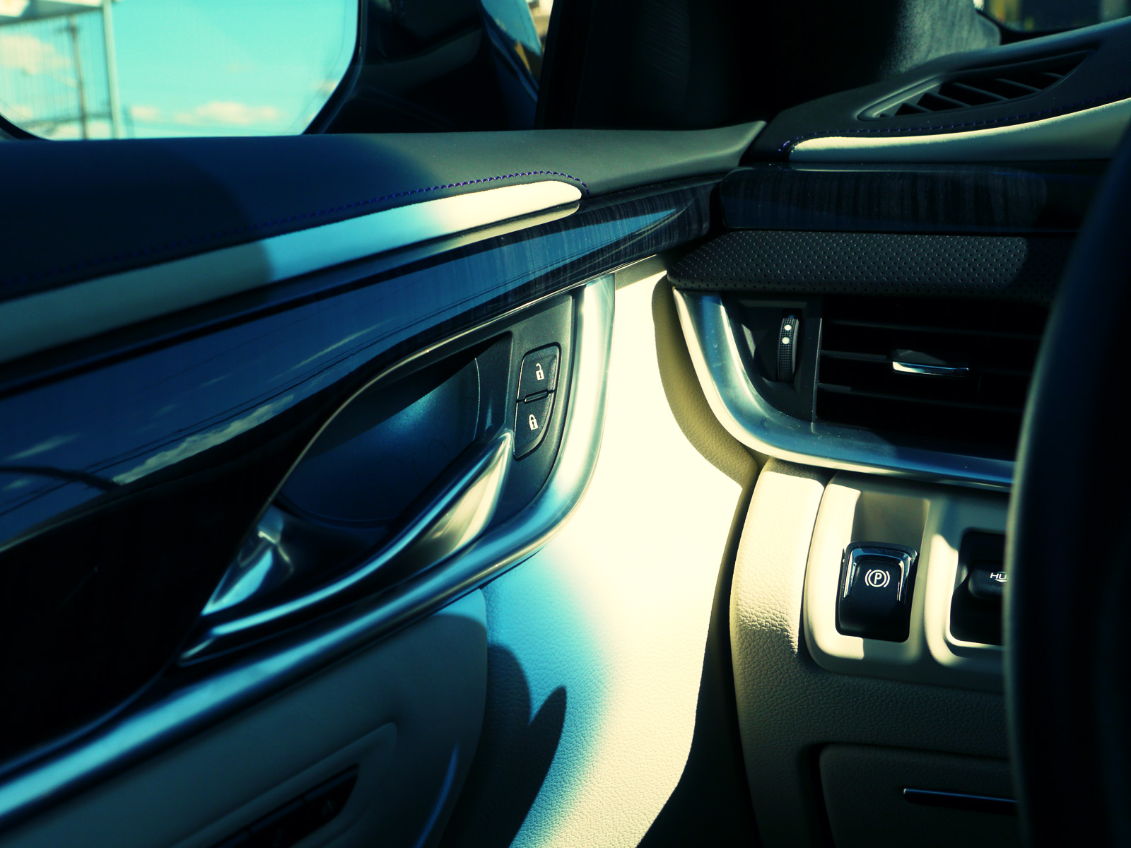
Grab the illuminated door handle, slip into its interior and the advantages of the transverse, front-drive layout are obvious - there’s a huge amount of space in here. But far from feeling like you’re sat in corner of an empty aircraft hanger, the wing-shaped IP, low-set driving position and unintimidating hood-to-H-point relationship means it feels less of a handful behind the wheel than its longer-hooded, more cab-rearward rivals.
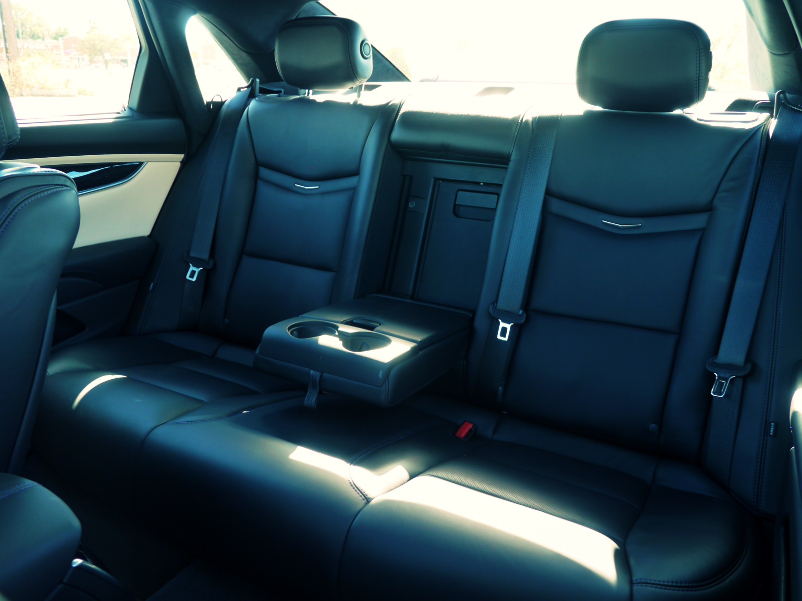
The rear of the cabin as well as the luggage area are also palatial - something that will no doubt win it favor in Cadillac’s second-largest market, China.
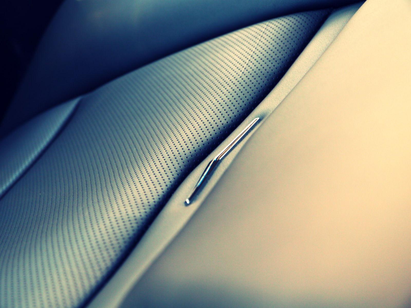
The standard of materials and trim on this Premium model was genuinely impressive. Perhaps some of the plastics and minor switchgear are no better than average, but the combination of leathers (in a three colors, some perforated), satin aluminum and subtle wood, topped with some playful purple stitching, creates a unique ambience that feels authentically American, yet globally appealing. It’s also laden with equipment, yet it fails to have the quite the sense of integral quality and feeling of superiority that cars in this segment require.
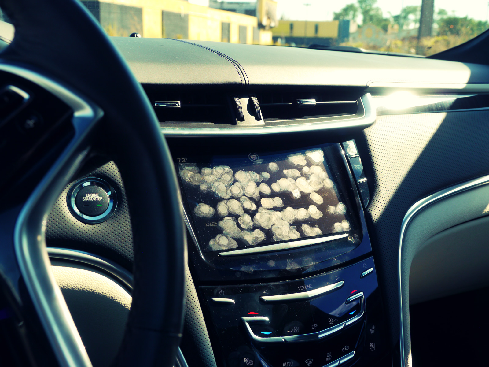
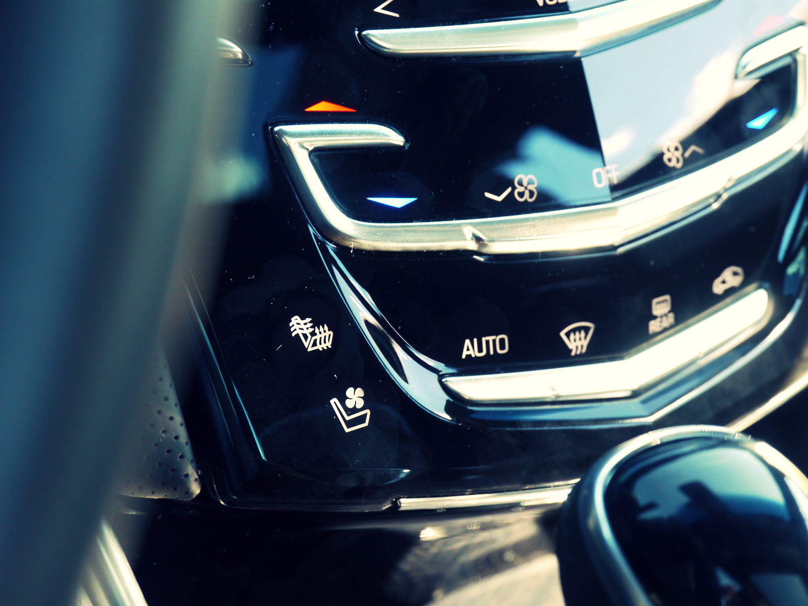
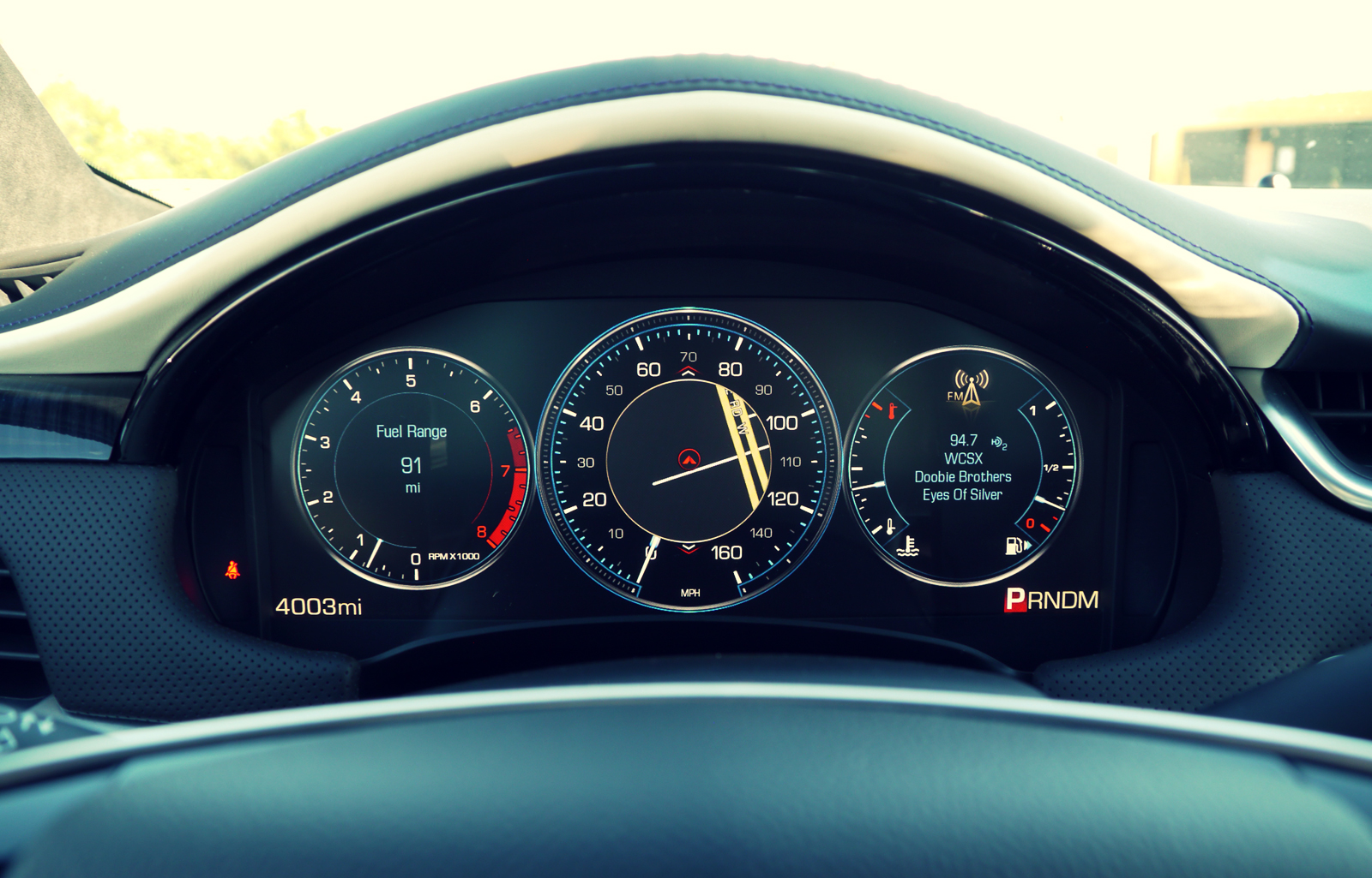
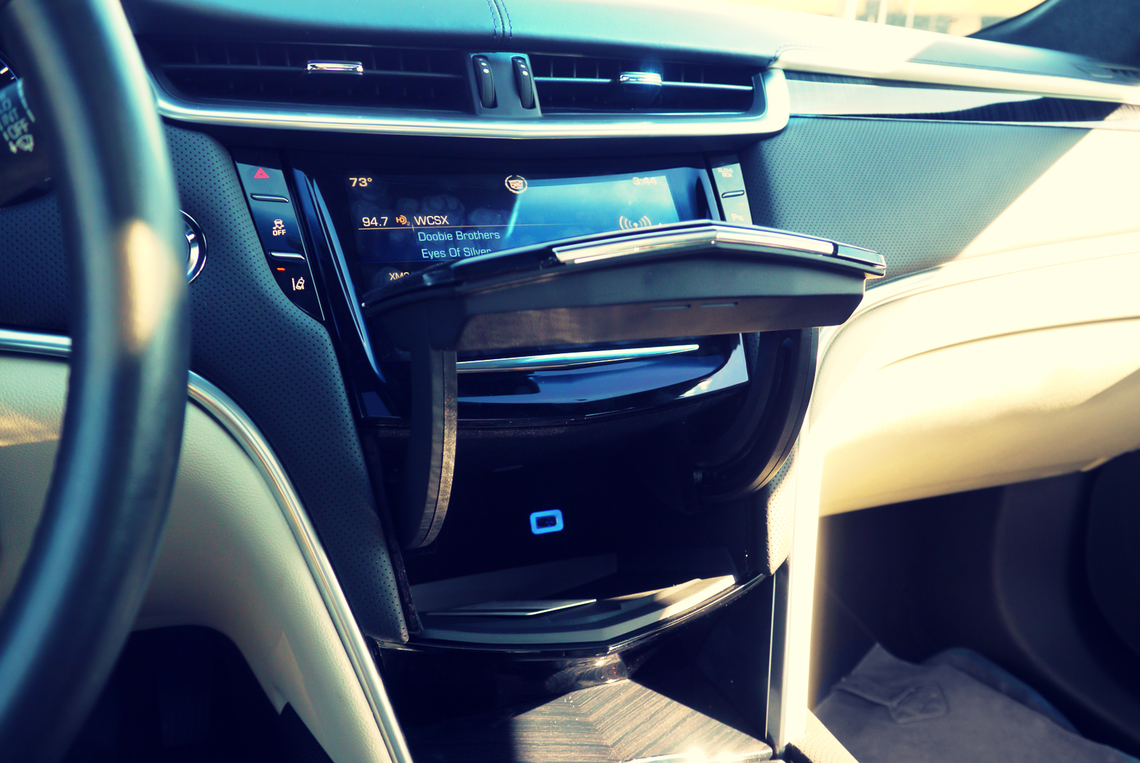
And there is an elephant in the room, or, more specifically, the center stack: CUE - Cadillac User Experience. It’s GM’s take on the ever-advancing realm of HMI integration, about which much has been written about previously. It’s accessed mainly through a central touchscreen, augmented by a digital gauge pack and heads-up display (HUD), to control the navigation and entertainment functions. This much is standard fare, the difference is in the ways in which the user interacts with these functions. The center stack features a series of touch-sensitive ‘virtual’ buttons that, like the screen, give haptic feedback through pulsing vibrations.
In theory this makes sense (even if we continue to question the suitability of touch-screen in cars, particularly when it comes to fairly complex, but often required actions, such as inputting destinations into the navigation system) however the system is too slow to react to inputs, meaning response is far from relative to demand. This often creates a feeling the system hasn’t registered an input, distracting the driver, who attempts a second command, only to discover CUE is lagging behind. This is compounded by the fact the touch screen and touch-sensitive auxiliary ‘buttons’ often require multiple prods to respond. It’s a system that, converse to its theory of simplifying the user interface, actually makes it frustratingly difficult. The feedback vibrations also feel unnatural and inconsistent. To make matters work the gloss black surfaces are impossible to read in sunlight, where they become a smear of greasy fingerprints.
It has to be said that what it does once underway is, on the whole good, particularly the excellent phone integration and clear, simple navigation on the central screen, gauge pack and HUD. The voice command function is also as good as any we’ve used. However the whole system needs a boost in processing speed to work as well as anything from the German premium brands.
This about sums up the XTS - it’s an interesting, characterful and thoroughly decent car, yet there are key areas in which it lags behind its European competitors. It feels like an upscale General Motors product than a truly premium proposition in its own right.
As suspected the XTS feels like an interim, makeshift model that sits somewhere between old Cadillac and new; competent and interesting, yet without the clarity and sophistication of the very latest products to wear Antoine de la Mothe Cadillac’s crest.
With updates to the frustrating CUE interface and a more appropriate platform, the rumored replacement certainly has the raw ingredients of a convincing luxury sedan. As it is, you drive the XTS conscious that it is pretending to be something it can’t quite live up to.

