A close-up look at the star debutant of Goodwood FOS, with the man who designed it
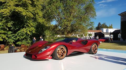
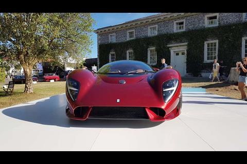
One can never be certain what you will find at the Goodwood Festival of Speed, which has essentially come to serve as Britain’s only international motor show as well as a grand, noisy showcase of over a century of motorsport history… and sure enough, we were caught by surprise. Tucked away behind the Cartier Style et Luxe concours lawn, outside the Stable Yard which flanks the south side of Goodwood House, was a gleaming red-and-copper shape nobody had ever seen before – yet which appeared to have been beamed in from the late 1960s (and given bigger wheels).
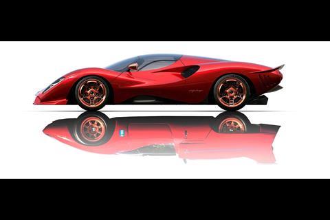
The sky-blue plinth on which it sat revealed its identity as the first new De Tomaso to enter production since the original company went into liquidation in 2004: the P72.
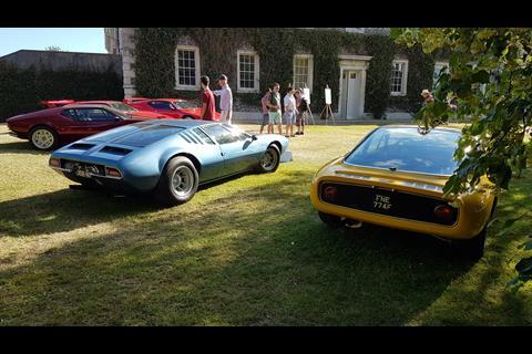
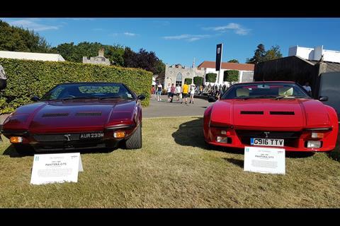
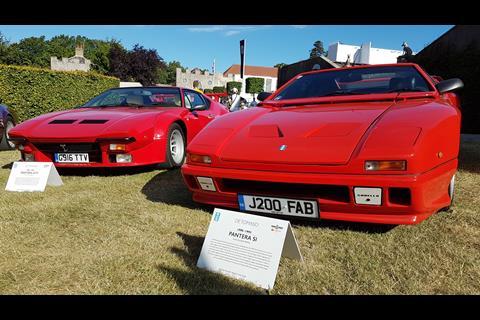
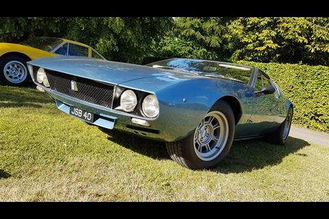
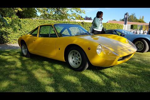
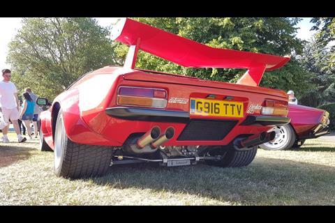
Classic De Tomasos – a Vallelunga, Mangusta and a trio of Pantera iterations – were gathered around it as if praying at the altar of this voloptuous vessel for the brand’s revival… and probably also serving to educate the uninitiated as to why the name is supposed to matter.
The name and brand have been owned by Hong Kong-based Ideal Team Ventures since 2014, which also owns the Apollo company originally founded by Roland Gumpert. That company’s car, the incredibly striking Intensa Emozione, donated its lower structure and Ferrari-based powertrain to the new, more GT-oriented P72.
Its designer, Jowyn Wong of Wyn Design, was on hand to talk us through how the P72 came to be, and the thinking behind it.
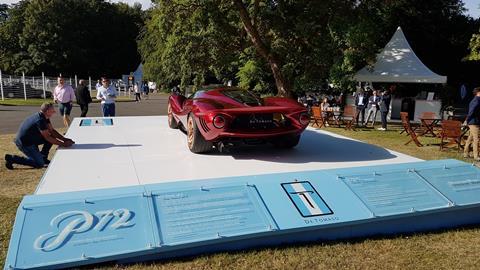
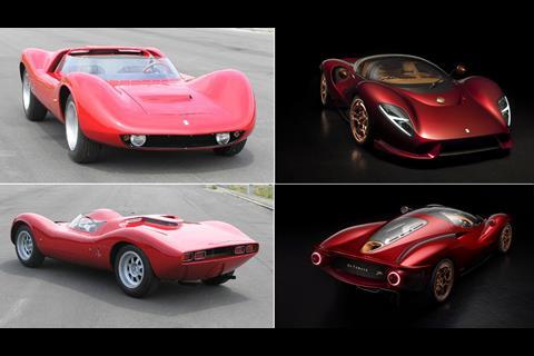
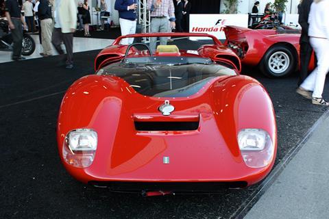
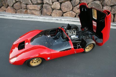
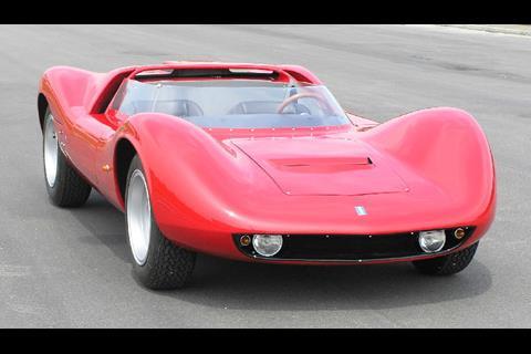
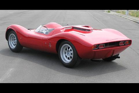
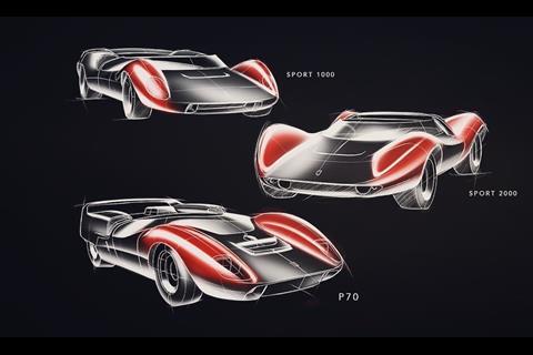
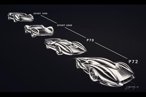
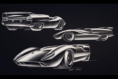
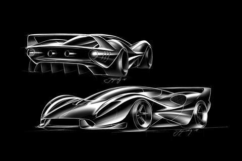
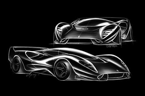
“When Alejandro De Tomaso founded the company, he was really into racing, and there were some particular cars in that period of time – the early ’60s – we looked at the Sport 1000, the Sport 2000 (well-known as a Ghia), and then the third one was the Sport 5000 which became the P70. The design language of this car [P72] is meant to reflect that period of time.”
While CDN readers might at least be aware of the story of the P70, these prototypes are likely not the first machines that people will think of when remembering the De Tomaso brand. Wong acknowledged as much: “Everybody expected a Pantera revival, but we really wanted to go back to the roots and this is really a demonstration, to tell the story which we believe has been misunderstood for a long time, and show the true extent and depth of the brand itself. So, this is a symbol of our history.”
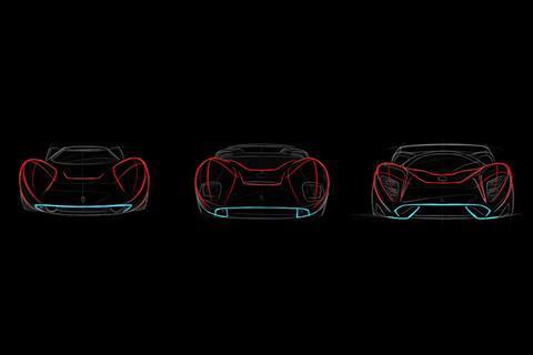
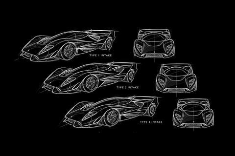
“We took inspiration from the fenders, the lights, the lines from the lower grille; the intake as well has been reshaped into a much more flowing, curvier design than it was before – taking this sort of ’60s Le Mans’ sexiness and bringing it back into modern design language. The design’s defined by generous volumes, clean lines – no hard creases or anything like that. If it didn’t serve a function then we left it out, so really it was just about being honest with the general volumes that capture that spirit of the ’60s and bring it back to the 21st century.”
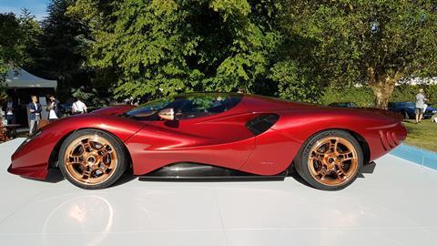
Perhaps the first thing to strike us in the morning sun at Goodwood was the candy red paint, which when viewed up close reveals glittery golden details. “This is a perfect spot to see it,” commented Wong, “because, the car transforms during the day and the highlights and the shadows bring it all out. The particular thing with candy paint finish is it really accentuates all the proportions of the car, so when it’s darker it’s actually really dark and when it’s light, it’s really, really bright.”
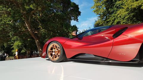
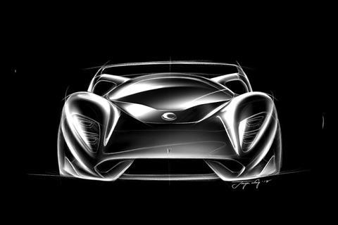
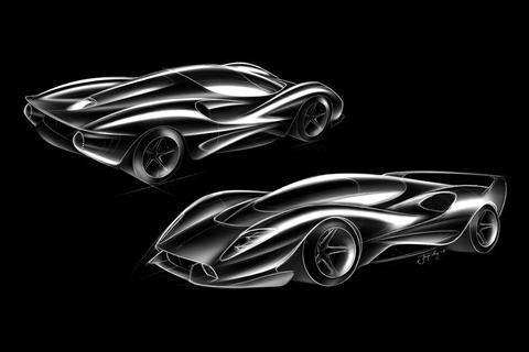
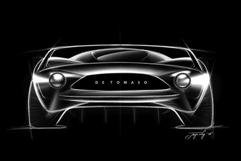
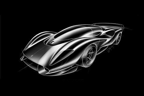
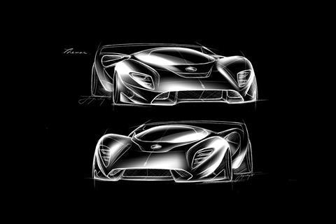
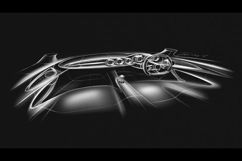
The DRG was defined using inspiration from the aforementioned De Tomaso prototypes (see sketches above). A single line arches from each corner of the ultra-low nose, over the front wheel and halfway into the door, where it fades into the vast engine cooling intake, itself defined by a single swooping curve which creates the leading edge of the rear shoulder.
The shallow, yet dome-like DLO demanded a completely new roof structure be merged with the Apollo IE’s carbon tub. Behind it, the roof tapers down into a central top-exit exhaust, sat at the base of the long rear window which reveals the gilded V12.
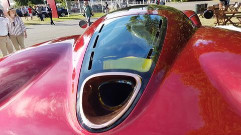
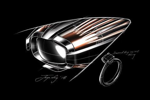
The surround for the straight-through exhaust is a single piece of copper, milled from a block. “We’ll have to keep hand polishing it, but it’s treated against extreme weathering,” conceded Wong, “because there’s a lot of heat around there, which would accelerate the oxidisation of the material.” Customers can of course choose a different material if they don’t fancy getting the polish out after a drive.
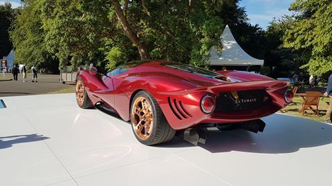
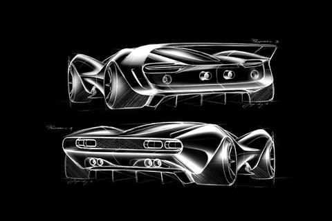
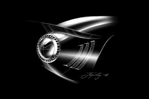
At the tail, shark-like gills lead the eye from the barely-contained rear wheel to the single-ring tail lights, with their own intricate detailing. Wong elaborated: “We have the ring here [brake/tail lights] but then we have these slots around the edge for turn signal, indicator and stop light as well. So when it comes on, it’s like, you’ve got this ring and then there’s this cool jewel-like accent around the outside.”
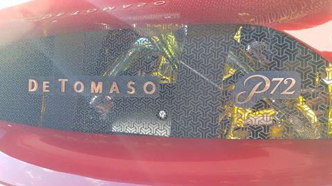
Between them, a central letterbox grille vents the extreme heat while letting people peer through to see the engine bay – pure old-school supercar theatre. The grilles themselves feature a ‘T’ pattern intricate enough that they had to be produced using a process called ‘chemical etching’ to make the hair-thin details accurate and repeatable.
While most of the trim details (including the ’60s retro ‘bullet’ mirrors) are rose gold or copper, the bay is lined quite comprehensively with gold. Wong explained why: “We also wanted to extend this theme of the copper and the rose-gold, and all the copper on the inside, and we wanted to use copper film… but had to use gold for heat management, because you can see that we have straight pipes – so it’s pretty loud! – and you can see that the pipes [near the manifold] have already turned blue, which indicates the amount of heat that’s going on in there.”
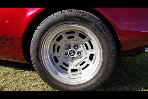
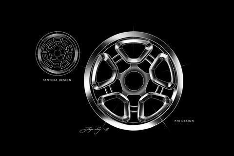
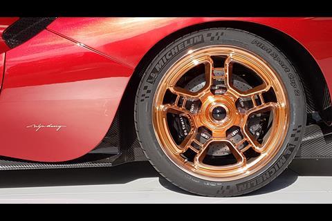
The copper-coloured wheels take their inspiration from a set of Campagnolos which adorned Pantera GTSs in the ’70s. “We took the core design elements, but to allow extra brake cooling we just spun the design a little bit, opened up the holes, generally taking that theme and applying it here in a more modern way.”
Wong admitted this wasn’t an entirely straightforward process: “The initial design didn’t really come to fruition but it’s really close, I’d say it’s like 90% there. We were happy with the initial design, but to get the structural strength there were a few compromises to give us a working wheel. The knurled centre cap was done to give some hints on the outside, to reference the inside as well.”
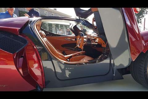
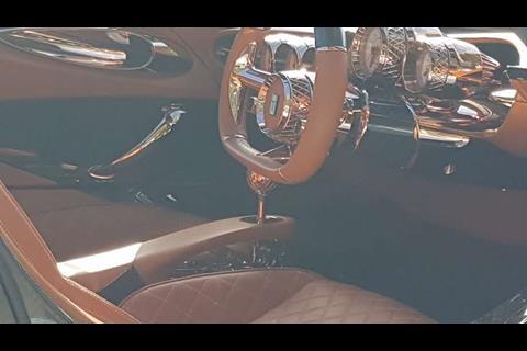
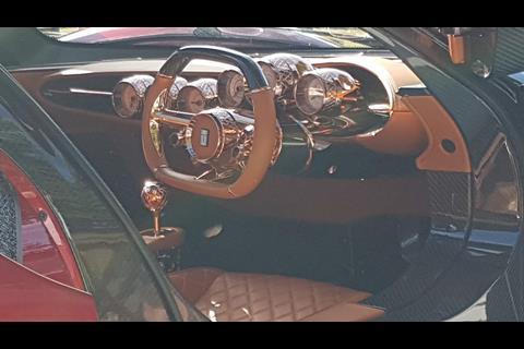
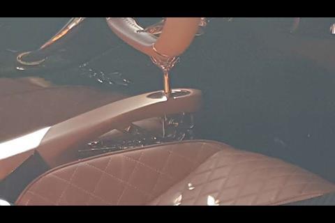
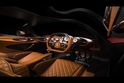
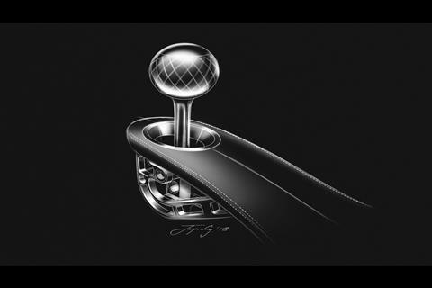
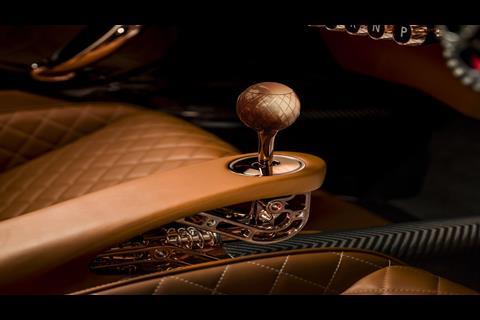
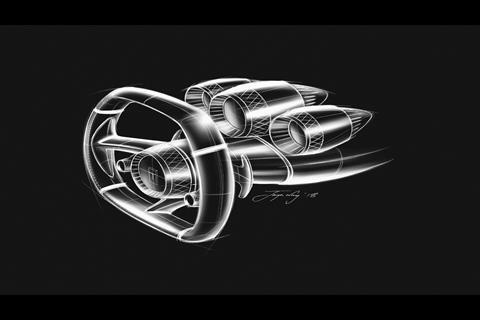
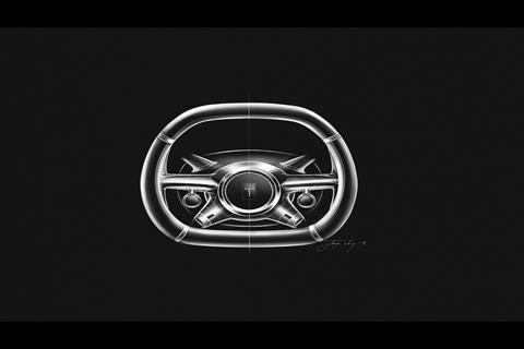
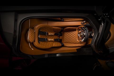
Speaking of the inside, lifting a dihedral door reveals a cosy but highly ornate interior, more akin to a Pagani than a ’60s prototype racer. Knurled bezels abound, with more knurling on the steering wheel centre, and the spherical gearknob which operates the exposed linkage to the show car’s sequential transmission (an H-pattern manual is in development). The amount of rose gold is matched only by the amount of carbonfibre, while tan leather seats and trim tie the two together in a less racy, more touring-oriented way. It is, of course, all customisable for buyers.
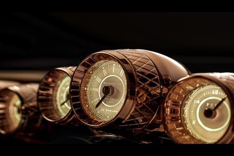
“The brief was to have this timeless, analogue classical experience, so we looked at the themes around the ’60s and ’70s and on the American side, they had these crazy cool, amazing and beautiful dials at the time – you see the old Mustangs and the like. We tried to bring this theme to the P72, because, you know, De Tomaso was also working with Carroll Shelby, so there was this American influence also, with his engines and so on. So we tried to bring this spirit back, blending this American theme with this Italian design language [also seen in that candy-apple red paint]. There’s no technologically-led influence in the way we’ve gone with the user interface, so there’s no big screen, there’s nothing like that. So, it’s really purely analogue.”
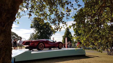
Your ’60s/’70s Italian-American kicks can be had for around €750,000, plus extras. Given that Wyn Design’s previous car was the completely extreme and spectacular Apollo IE, the clean and classical P72 goes some way to demonstrating the design consultancy’s range, as while the two are both V12 hypercars on the same base, within that formula the two designs couldn’t be more different from each other.
But is the De Tomaso brand really here to stay, or is this ultra-luxe special the extent of what we’ll see in the foreseeable future? Wong is clear that the latter is not the case: “It really is the beginning of the comeback for De Tomaso. For the brand, we’ve really got a lot of plans regarding its future, and this is the first part to demonstrate that it’s serious; we do want to be properly recognised alongside the likes of Ferrari, Lamborghini and all those guys because Alejandro de Tomaso really did deserve that kind of recognition, because of what he achieved in that period of time.”
Surely then, that means we’ll see a more direct rival to the Italian establishment next. Maybe that elusive Pantera revival could even take the form of a 488/Huracan/720S rival, we wondered aloud… “So your supercar market, the 200-300 grand bracket, something like that? Well maybe less, actually… Yeah, there are definitely plans to look into this [business] model,” confirmed Wong, “but it really depends on the evolution of the company and how far we can push the brand out there, and to our clients – and then we’ll go from there.”
This opening act has certainly grabbed headlines. We will wait and see what the second act brings to the De Tomaso comeback show.












No comments yet