Buttons are making a slight return thanks to revised guidance from Euro NCAP. Drew Smith considers what we lost in the move to screens, and what we might gain from the new rules
In news that will both warm and chill hearts, Euro NCAP, the European automotive safety body, has announced that from 2026, automakers will be “incentivised” to include a greater number of physical controls within their vehicles. A failure to respond will make it impossible for a new vehicle to be awarded their much-coveted 5-star safety rating.
Putting aside for a moment how radical a change the incentive might drive (some industry experts reckon that it’s insufficiently aggressive to drive meaningful progress) let’s take a moment to revisit what we lost in the shift to screen-centric interaction models, and what we might gain with just a little more knob, button, and rocker in our lives.
The psychological impact of making something yield to our command is a powerful one. We get the feeling that there is a direct correlation between our wishes, our acting on them, and the coordination of forces to answer them. As a consequence, our world feels a little more controllable and therefore a little more knowable and we feel a little safer. That’s deeply satisfying.
But if I can’t see the controls for these features and, by turns, if I can’t easily activate them then do they really exist? And if they don’t, then what the hell am I paying for?
It’s not for nothing, then, that decades of automotive journalism fetishised attributes such as steering feel, road holding and grip and slip, or the particular thunk of a door, the snick of a switch, or the zing or whomp of an engine. The modern day equivalent — less focussed on driving because so are we — are those ASMR videos on YouTube. Both speak to the deeply sensory nature of our relationship with cars, one in which friction and its management has been key to both our safety and enjoyment.
Now, pull out your phone and tap its screen. Go on, I dare you. Grab the phone of the person nearest you — promise you’ll give it back — and tap on its screen too. Find a tablet if you can: you know what to do. While the backgrounds, apps, and enclosures might change, how boring — how interminably, exhaustingly dull — that lifeless tap has become. There is no friction, no feel, no Newtonian sense of equal and opposite reaction to our action. We’ve lost our sense of knowability of how the thing works. We’ve ceded our sense of control to the software inside.
Blame among Western OEMs for the shift is freely apportioned: the suspiciously-monolithic whims of ”the Chinese market”, the need to accommodate ever more functionality, or the FAFO trend set by a certain Californian car maker. But at the end of the day, it’s simply cheaper to engineer a massive screen than a myriad of buttons.
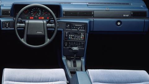
Historically, how a control suggested its function, how it moved and how it made us feel articulated a brand’s relationship to its customers. Think of the ultra-rational Mercedes-Benz electric seat control, which reached its zenith in the W140 S-Class and R129 SL. So deeply considered was this interface that the radius on the memory buttons differs from that of the memory set button, so that one might tell the difference without looking. Or what about the interior and exterior door handles of the OG Saab 900, or Volvo 7-, 8-, and 900 series? Here were interfaces that welcomed the thickly-gloved hand of a deep Swedish winter.
Sometimes, it seems that the cool, silvery slickness of the Rolls Royce organ stop is all that remains of this deeply haptic era.
Buttons also signalled status in ways far more subtle and interesting than a cobbled-together gigascreen, or a subscription to a 4.5 second 0-60. Sure, one could observe the sheer number of the things (BMW E38 7-Series), or the absence of them, made more glaring in any low-spec Japanese car by the presence of blanking plates. But then there was the absence-not-absence of (again) Sacco-era Mercedes, where any shame you might have felt for not optioning the town-and-country horn was somewhat soothed by an uninterrupted expanse of zebrano wood or even walnut. Nobody but you was any the wiser that you’d cheaped out on the build sheet.
But when those buttons were present, they signalled something else, too. Our cars have never been more feature-rich: I can have a hot-stone massage in my Maybach, a display of minor pyrotechnics in my BMW, and have the brittle edge of my Audi’s suspension softened. But if I can’t see the controls for these features and, by turns, if I can’t easily activate them then do they really exist? And if they don’t, then what the hell am I paying for?
So rather than looking at the impending change in Euro NCAP’s testing as a pain to be dealt with, what if instead we saw it as an opportunity to rediscover our haptic characters? Or, perhaps, create them anew?
Buttons make what we paid for legible. Those satisfying clicks or thnks or snicks or sliiiides remind us that all the effort required to attain them was worth it. They communicate to customers the real-world, seeable, touchable and manipulable value of the car they bought.
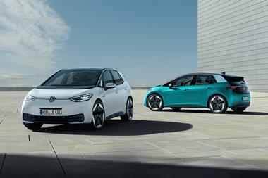
To see the value of buttons to bands, one need only look at the injury done to Volkswagen and Volvo when they decided, in ways entirely inconsistent with their positioning as humane pragmatists, to take them away. Or what happens when physical failsafes for digital door handles elude us.
Conversely, note the return of buttons to certain Fords, Audis, and Land Rovers, or the presence of pleasingly chunky jog dials on the steering wheels of the new Rivians. In the case of Hyundai, people are almost fainting with pleasure in the knowledge that the facelifted Ioniq 5 has even more buttons than before, all designed to make accessing the value of the vehicle that much easier.
So rather than looking at the impending change in Euro NCAP’s testing as a pain to be dealt with, what if instead we saw it as an opportunity to rediscover our haptic characters? Or, perhaps, create them anew? Either way, we’ll deepen our connection to our customers in the process.
Drew Smith is an independent design strategist at StudioPhro*, and publishes a newsletter and podcast called Looking Out










No comments yet