Car Design News chats to head of design Joaquin Garcia in Milan following the launch of the Asso di Picche in Movimento concept, getting close up with the original 1973 show car that embodied the company’s fascination of design and engineering
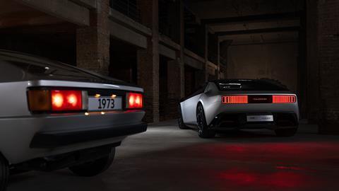
Five decades on, Italdesign’s 1973 Asso di Picche concept still looks a showstopper in the metal. Based on the Audi 80 chassis, the four-seater coupe carries the geometric, trapezoidal design cues so typical of the time (and reflective of contemporary manufacturing techniques.) Inside, occupants would be met by the polar opposite of the exterior, with soft finishes and an innovative cylindrical instrument panel.
It is easy to see why head of design, Joaquin Garcia, was keen to give new life to the project as it celebrates its 50th anniversary. On a walkaround of both the original and its successor, Garcia gave CDN an insight into the design process and – without prompts in relation to D4P – explained why the company has coined a phrase to reflect the combination of ideas and engineering: ideneering.
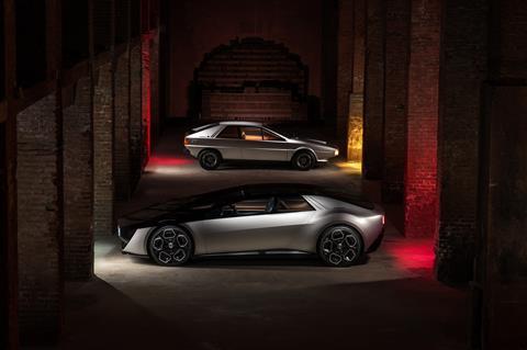
Car Design News: The original Asso di Picche is quite something. It must be nice to have these kind of heritage projects to look back on.
Joaquin Garcia: We are proud of our rich history but we also want to project it into the future, because as designers this is our job. We are always in motion. And this hints at the name of our project, “In Movimento.” We are a very dynamic company, always adapting, always changing, always growing and learning.
CDN: There are plenty of other objects in front of us here – an espresso machine, champagne flutes, furniture. How did you decide what to pick out from Italdesign’s back catalogue for inspiration – beyond the original Asso di Picche, of course…
JG: Yes, if we were to look back over the last 50 years the list would be endless. We picked some icons from Italian design but also tried to understand why they became icons. It turns out it was mostly due to their simplicity and their innovation. With our new concept we have learned from the past with a very free interpretation.
We are proud of our Italian craftsmanship, but let’s not forget, most of the company is actually about engineering
CDN: Looking at the original car, the sharp ‘70s exterior really contrasts with what we see in the interior. How did this all come together?
JG: When the original concept was shown at the Frankfurt motor show in 1973 it was very innovative and still feels very modern today thanks to its minimalistic design and clear architecture. The body section is monolithic, while the interior has this cylinder which was kind of an early vision of digitalisation. The feeling in the cabin is very cozy, almost like a lounge. As you can see, it’s a very puristic, architectural vehicle.
It’s important to note too that the tools which were used at the time obviously influenced the final result, giving us these horizontal, tense lines – plus the fact that the models were done in plaster, which also influenced the result to a degree.
CDN: If the original was shaped by the tools available at the time, how did that play out with the design of the 2024 “In Movimento” concept?
JG: Nowadays you can almost do whatever you like, to be honest, it’s more a matter of cost. This is of course just a design model, but if we were to put this into production it would maybe be challenging in terms of doing what we have with the glass. The front windscreen would need to be checked for double vision, for example.
Joaquin Garcia is speaking at Design4Production on 15 May 2024 in Munich. Register here to join experts from the likes of ArcelorMittal, Changan, Ford, Hyundai, Italdesign, Nissan, Valeo and Volvo.
JG: But we worked quite closely with the engineering teams on this to make sure the design would be feasible – right through to basic ergonomics, ingress, egress and other things that you really cannot mess up.
And let’s not forget that the architecture of the car has changed: cars today are wider, wheels are bigger, packages are different. Even people are different; people are taller now than they were 50 years ago. So the complete package has changed. We also want to make technology feel less intrusive, more human, more approachable, and digital tools have allowed us also to be much more sensual, more expressive with the design.
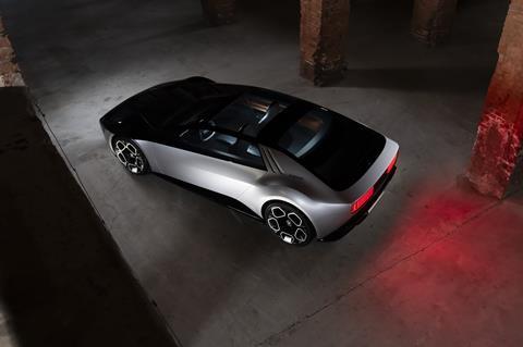
CDN: The glass house looks enormous combined with the transparent front end. What was the thinking behind extending all the way through with a ‘black mirror’ effect?
JG: The transparency allows us to celebrate technology, for example if we are imagining that the motors are integrated directly in the wheels to liberate space at the front of the car. We could have luggage or other things on show too. It could also work if it was body coloured, but the message was to celebrate technology and bring the concept into today’s highly digital world. We also took the cylinder on the dashboard and reimagined it with more of a transparent execution, showing only what you need, while rolling screens give extra information when required.
CDN: Tell us about Italdesign’s new phrase, ‘ideneer’?
JG: We are very proud of our Italian craftsmanship, but we are also very technical as an engineering company. Let’s not forget, most of the company is actually about engineering. As such, we wanted to bring together the creativity of the designers and the technology from our colleagues in engineering, which is exactly how the company was founded by Giorgetto Giugiaro and Aldo Mantovani: one designer, one engineer. This is still very much in our DNA.


















No comments yet